This sweet ebonite eyedropper fountain pen from India just joined my collection. It fills a little gap, because although I have a good representation of pens from Indian manufacturers like Deccan, Ratnam, Ranga, Mohi, Airmail/Wality, and Guider, I was missing a Brahmam: the business stopped producing pens before I really got into the Indian pen scene.
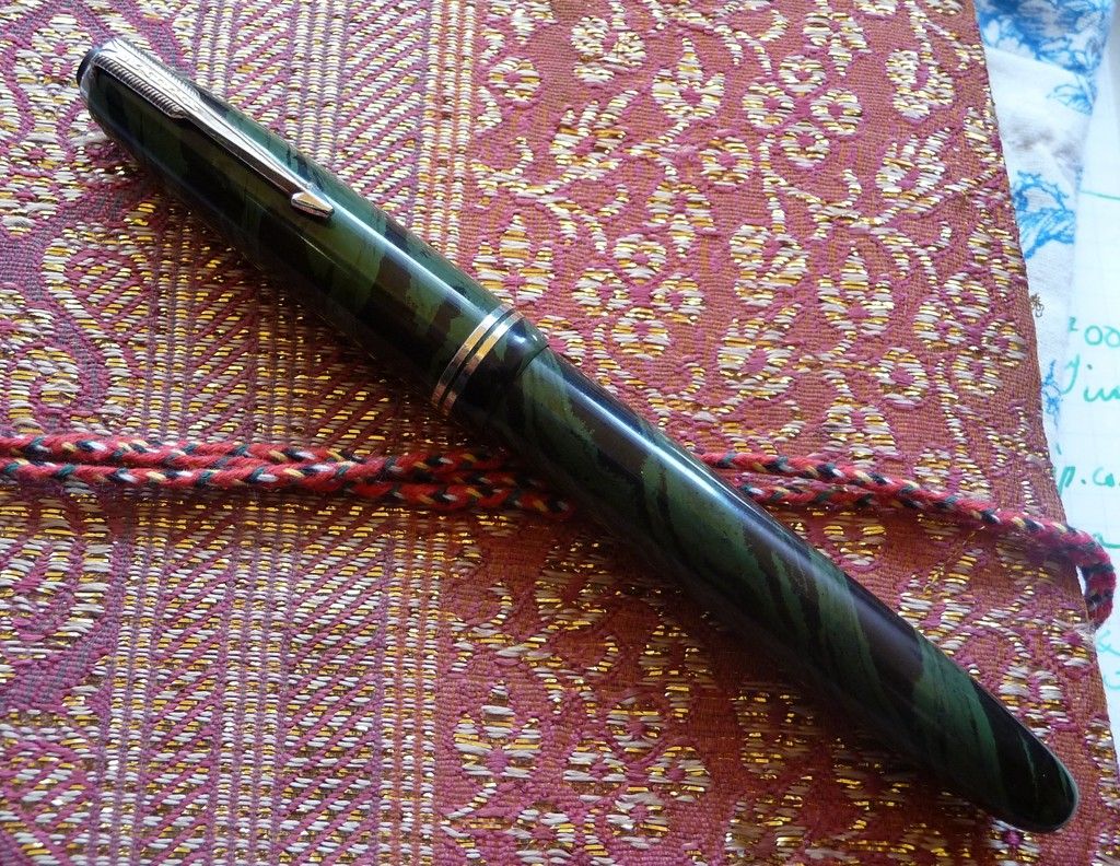
I love this ebonite. A lot of modern Indian ebonite has quite busy patterns - very ornate swirls that remind me of peacock feathers or eighteenth century marbled paper. But this has a big, bold, diagonal stripe. If tigers wore jungle camouflage this is what they would look like.

The pen is nicely made. The arrow clip's feathers are well defined, the ebonite is polished to a high gloss, and the section has a really sharply cut lip and beautiful flare to it. The only blemish, to my taste anyway, is that I think the tassie has been left too proud, and should have been turned down another millimetre or so... but that's nitpicking. All in all, it's a nice pen, and it doesn't write badly either - a stiff nib which has just a little feedback, writing the fine side of medium or the broad side of fine, with no line variation, but ready and willing and not scratchy at all.

Like many Indian pens it shows influences from a couple of different sources - the nib looks like a Sheaffer with the scalloped line between two colours of metal (a bit of plating loss on the 'gold' section), but the cap and clip are definitely Parkerish. Neither Sheaffer nor Parker ever came out with this kind of ebonite, though!
I love this ebonite. A lot of modern Indian ebonite has quite busy patterns - very ornate swirls that remind me of peacock feathers or eighteenth century marbled paper. But this has a big, bold, diagonal stripe. If tigers wore jungle camouflage this is what they would look like.
The pen is nicely made. The arrow clip's feathers are well defined, the ebonite is polished to a high gloss, and the section has a really sharply cut lip and beautiful flare to it. The only blemish, to my taste anyway, is that I think the tassie has been left too proud, and should have been turned down another millimetre or so... but that's nitpicking. All in all, it's a nice pen, and it doesn't write badly either - a stiff nib which has just a little feedback, writing the fine side of medium or the broad side of fine, with no line variation, but ready and willing and not scratchy at all.

Like many Indian pens it shows influences from a couple of different sources - the nib looks like a Sheaffer with the scalloped line between two colours of metal (a bit of plating loss on the 'gold' section), but the cap and clip are definitely Parkerish. Neither Sheaffer nor Parker ever came out with this kind of ebonite, though!