Friday 16 December 2016

Fountain pens: where to start. 3. Inking it up

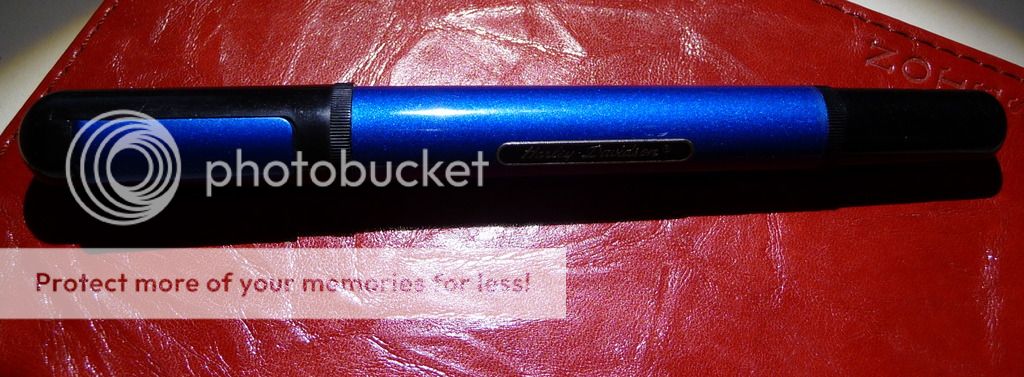
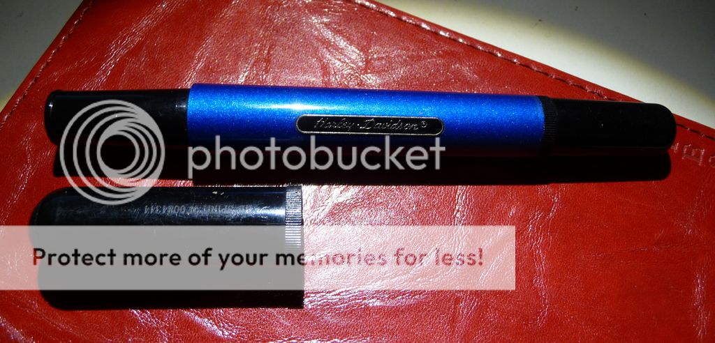
Fountain pen ink used to be really easy to get in any stationer's. Nowadays, it's trickier. You may have to go online to get what you want, or find one of those rare bricks-and-mortar pen shops, though some department stores still carry a narrow choice of big brand inks (Waterman, Parker, Cross).

Your first decision is going to be: bottled ink or cartridges? There are pros and cons to both.
  • Cartridges are a great way to go for the beginner. No mess, just slot them into your pen. Most pens will take an international standard cartridge (but do check, just in case). They're easy to carry in a handbag or pocket. Cons? Relatively expensive, and not always available in the widest range of colours.
  • Converters offer more options. You can use a wider range of inks. Bottled ink will turn out cheaper per millilitre than ink in cartridges. But you need to carry a bottle with you, and there's always a risk of it leaking (or breaking, if it's made of glass). Plus refilling is impossible if you're in a moving car, on a train, or likely to be jostled by kids or pets. If you do refill from an ink bottle remember to put the lid back on! (That's the voice of experience, that is.)
Other things you need to know about inking up your fountain pen.
  • No, you don't have to use only Pelikan ink in a Pelikan pen, or Parker ink in a Parker. You can use any ink you darn well like..
  • Except... Avoid calligraphy inks and Indian ink, as these will clog up your pen. They're made for dip nibs, which you can clean much more easily. Don't use Rotring technical pen drawing ink, either.
  • Red and purple are probably the worst colours for staining. If you've bought a transparent pen, you may need to clean it quite meticulously after using a dark red.
  • Some inks have a reputation as being 'wet' or 'dry'. 'Dry' doesn't mean they're not liquid, but refers to their flow characteristics - they will tend not to flow as readily as 'wet' inks. It's all to do with the balance between the dyes and the lubricants used. Pelikan inks tend to be 'dry', and some Herbin inks write dry, too. Waterman blue is a good well-behaved ink while most Noodlers inks are on the 'wet' side.
  • Remember that an ink can behave differently depending on the size of nib you're using and the kind of paper you're writing on. Before you give up on an ink, try a different combination of nib and paper and see if it behaves itself.
 By the way, cartridges can be reused by filling them from the bottle using a syringe with a blunted needle - so if you were given a pen that didn't have a converter in it, you can still use bottled ink if you're careful.

Fountain pens: where to start - 2. Recent 'vintage' pens

There are various definitions of the word 'vintage', particularly if you look on ebay. If you are still getting started in fountain pens it's possibly not time to start thinking about a Waterman Patrician or a Parker Snake, but it could be time to consider some pens of the past fifty or so years that are still widely available and represent solid value.

Secondhand pens can be found through ebay or through sellers on FPGeeks or Fountain Pen Network, as well as 'in the wild'. If you're lucky you can find NIB - 'new in box', perhaps coming from the inventory of stationers and pen shops that have closed.

These are all cartridge-converter pens. C/c is the prevailing modern system and pretty easy to get used to, not any more difficult than putting a refill in a ballpoint or rollerball. If you've been terrified by the sight of instruction booklets showing how to fill a Vacumatic or eyedropper pen, this is a lot more user-friendly. (Personally, I love piston-fillers, but if you are starting out, and particularly if you take a pen to work or travel with one, it's nice to have the choice of using mess-free cartridges as well as being able to fill with bottled ink.)

I could quite easily have mentioned the Waterman Kultur and Phileas here, as the Phileas has been discontinued and many versions of the Kultur seem not to be available any more. There's a definite fancy for these pens and sometimes you see them at crazy prices; on the other hand I got a super golden metallic effect Kultur for two quid, and free postage, a couple of years ago.

Waterman Laureat is another lovely pen that you can find relatively easily - a bit up-market from the Kultur. It's a 1980s pen with a tubular design, in various lacquer colours and with a surprisingly comfortable ribbed section. Laureat nibs are quite fat and wet and enjoyable to use. As with the Kultur, prices vary, but you can sometimes snap up a bargain. Do look closely at the lacquer, as it's impossible to repair if it gets chipped.

Waterman Laureats and another (spot the odd man out!)

The Parker 45 was born in 1960 and was so successful that Parker carried on making it until 2007. It was intended to be a decent affordable pen and that's just what it delivered. Additionally, it offered screw-in nib units, allowing a wide choice of nibs to be made available. The 45 came in many different finishes, including the 'flighter' (stainless steel), solid colour with steel cap, solid colour with plastic cap, and patterned metal finishes - the latter are now very collectable, so if you see one at a bargain price, nab it! Inevitably, the pen that turns up most often is the basic black. I love the 45 - just give the nib section a good soak, to get rid of dried ink, and when you think it's clean, stick a cartridge in, and it will probably write first time. I find the plastic bodied pen a little light, and I'm glad I managed to get two flighters, which just have a better feel in the hand.

Some 45s come with gold nibs. And sometimes you can find them for nearly nothing in your local junk shop.


The Pelikano comes in various versions but the one I love is the P460 which came out between 2003 and 2009. It's a fairly fat tubular pen in translucent plastic, with a metal cap and big fat arched plastic clip, and comes in vibrant colours including pink, orange, bright red, purple, and ...black. Unusually, the black version is the one you hardly ever see! It was intended as a school pen and has a gently textured section to keep your fingers from sliding, and while it may not have the good looks of the Laureat I think it's a charming little pen with attitude.

The Pelikano - bright and jazzy
I bet someone will tell me there should be a Sheaffer in here somewhere. But I'm not much of an expert on Sheaffers and the one I do like, the Targa, is quite expensive. I hope one of my readers can make a recommendation!

Fountain pens: where to start - 1. New pens

Getting into the world of fountain pens is fraught with difficulty. The difficulty doesn't lie in locating a fountain pen - that's the easy bit. The difficulty is that if you get the wrong fountain pen, you'll probably say 'oh well, fountain pens are not for me', rather than get another, different one to see if you like it better. So here is a guide on what's available for the beginner - and particularly, each pen's vices and turn-offs, so you can easily see whether or not you're going to like it.

There are some wonderful bargains among Chinese and Indian pens, but I wouldn't advise beginners to take them. Quality control among Chinese pens can be hit and miss, and the 'misses' are frequently just horrible. With experience, you'll learn how to tinker with them - but it's like getting a vintage car to learn how to drive, not necessarily the best way to start. Indian pens are lovely (anyone who reads this blog knows that I love them), but don't always have great nibs, and often come as eyedroppers (trickier to fill, prone to blotting), so I'd suggest you get two or three other pens first before trying them out.

The Kaweco Sport is a great little pen - and 'little' is the right word; it's a pocket pen, with a cap that turns into the barrel when you use it. It comes with easy-to-swap nibs, so if you start with a fine and find out you want a 1.1mm stub, you can buy a new nib at relatively little cost. Lots of different colours and materials available - transparent, opaque, aluminium, even brass, though some of the metal finishes are more pricey and no longer belong in the budget category.   It's a robust little pen, that you can easily carry around in a trouser pocket or at the bottom of a handbag. I also like the flare of the section that holds your fingers in just the right place and stops them slipping on to the nib or too far up the pen. Turn-offs? Nibs can be dry and hard starting, and if you have big big hands, you may find it too small. And such small pens don't hold a lot of ink, either, plus the converters aren't really very good.
These are the 'art' sports, rather highly priced but just the same shape and size as the cheapie 'Ice' sports


The Lamy Safari is another great beginner pen, and it's very easy to find - most department stores and many graphics shops and art shops carry it, or its desk pen version the Lamy Joy. It's incredibly robust, like the Sport comes in plastic and aluminium versions (the Al-Star) and different colours, has a modernist design vibe, and has swappable nibs that you can easily purchase online at a low cost. There's a little ink window so you can see how much ink you've got. Turn-offs? Some people hate the triangular section, while others love it - it was designed to help get your fingers in the right grip for holding a fountain pen, so if you can tolerate it, it will help you get into good pen-holding habits. You'll know straight away if you like the look or not.
What Joy! simple but stylish pens with great calligraphy nibs


Japanese companies are terrifically good at entry-level fountain pens. The one I love is the disposable Pilot V-pen - incredibly cheap, and I have never had a bad one. They write quite wetly straight out of the box, and they are actually refillable, though it's a bit tricky and can be messy. Turn-off? Cheap plastic, and as for their looks, I think 'functional' is the word. Further up market with Pilot you might consider the Metropolitan (I'm not sure why it's called MR in the UK), a metal bodied pen available in various funky finishes including bright purple and with leopard skin and crocodile accents. A great writer, but with, for me, a major turn-off - a sharp step between the section and the barrel of the pen. I'd rather just buy more V-pens!


Sailor offers a number of entry-level pens, such as the Sailor Lecoule. If you looked at the Sport and Safari and thought "NSFW", this pen could be for you; it has a more conservative styling and comes in 'stone' colours such as lapis (blue) and garnet (red) as well as funkier combinations. As with most Japanese pens, the fine and medium nibs are a bit finer than many Western nibs. Platinum offers the Plaisir, another low priced Japanese pen that's a reliable starter.

Faber-Castell offers the Loom, with a metal body and plastic cap. I'm a big fan of Faber-Castell's nibs - they may look a bit odd, with no breather hole, but they write really well. The section has five textured rings on it to stop your fingers slipping, which is an understated but useful feature. Turn-offs? The caps can get loose after a while and no longer snap back on properly, which could mean ISPS (Inky Shirt Pocket Syndrome).

Now for two pens that don't often get mentioned. That may be because they're not easy to find outside their home markets in Europe, but I think they are lovely pens to get started with. First off, the Waterman Kultur. Waterman Phileas (an up-market version of the same model)  and Kultur can sell for silly prices on ebay, but French supermarkets still have the Kultur for ten euros or so. (All I can find online is the FNAC website which has it a little dearer.) It's a big pen, nice for those with larger hands or arthritis/RSI issues, and has a nice big nib, too (usually M or F), and I've found it super reliable and fun to use. I also like its slightly art deco styling.
A few of the different finishes available for the Waterman Kultur

And finally... the Pelikan Twist. It's almost like a 21st century update of the Bauhaus Safari to a funkier, Zaha Hadid or Frank Gehry aesthetic. A delightful pen if you don't need to be conservative, with a similar grip to the Safari, and incredibly cheap.

Wednesday 9 November 2016

Big and bold - the Guider Zimbo


I've just received a lovely pen in the mail, a Guider Zimbo eyedropper in bright red which I bought through Fountain Pen Revolution.

What do I love about this pen? It's red. It's bright red. It's red that positively glows in the dark. It's ... very, very red.

The acrylic is wonderfully polished and the colour is both intense, and slightly translucent. If I hold the pen right up to my desk lamp, I can see how much ink there is in it - just. (The disadvantage, of course, is that the cap threads show through on the outside where the cap is thinnest.)

What do I also love about it? It's big. It's not the biggest (Guider also makes a Super Zimbo, which is just silly) but it is a good large chunk of pen, and sits very happily in the hand. Over 15 cm long, with a 15mm barrel diameter, but not too weighty, it's comfortable to use.

I also like the Guider clip and tassie - obviously modelled on Parker's arrow clip and the Vacumatic/51 cap, and non the worse for that.

Zimbo in the middle, with a subfusc Oliver and a lurid Airmail
The bad news, as often with Indian pens, is that the nib and feed are below par. The nib is a tad scratchy and writes very dry, while the feed has allowed this beggar to burp twice, badly, although it's still very close to full. I think some tinkering will be in order, and I'm going to look in my parts box to see if I can replace both. (That said, there is nothing wrong with the nib - I've been taking notes for a day or two with it, and it works, a pretty fine line; but it's not a positive pleasure to use, like my Lamys and Pelkians...)

I'm glad I got this pen. It's a character.


Monday 31 October 2016

Sheaffer No-Nonsense Old Timer - the past made new

Sheaffer No-Nonsense pens are lovely cheapies, for the most part; but every so often you find one that has a bit more class to it. That's the case with this 'old timer', black plastic that is patterned in a nod to the chased black hard rubber pens of the early 20th century.
No Nonsense, just a lot of style
I found this one in the wild, together with a bunch of rather similar advertising pens that weren't anything to shout out about. This is a lovely pen. A good nib, a wide metal cap ring, and that zig-zaggy pattern that brings it all alive. Quite clearly, the designer looked at the classic Sheaffer flat-tops of the 1920s as his inspiration, and the pen embodies all the best aspects - the gold plated cap band and section ring and clip, the shape, the gently flared section, and the chasing.

Unlike the original BCHR flat tops, it's made of robust plastic instead of fragile ebonite, and it is a cartridge-converter not a lever filler (and this one had the converter in, which almost never happens!). It has a steel nib, with gold plating, rather than the unplated steel nib of the lower-end No-Nonsenses. It feels good quality - one of the benefits of having caught it in the wild is that it was sitting next to very similar, but crappy, pens, and just looking at the clips, the detail of the section, and the crispness of this material set against the rather soft and easily scratched plastic of the other pens, I could understand just what a good job Sheaffer had done.

There are, I think, six patterns in total in the 'Old Timer' range. I have two. The photo below is not a good one, but you can see the pattern here - a sort of spiral of chasing around the pen that Penhero calls 'flamme'.

The No-Nonsense originally came out in 1969, and belongs to a generation of pens from the Big Three that look back to the golden age. There's the new Parker Duofold, like the No-Nonsense looking back to the great flat-tops of the classic period; that came out nearly twenty years later, in 1987. There's Waterman's Lady Elsa, reusing old galalith stock to create colourful petite pens, and Charleston with its references to the Hundred Year Pen in its shape and mid-barrel band, and the 3V's clip attachment with the hexagon on top of the cap.  But these are later pens - Sheaffer, I think, got there first. Even Parker's Big Red - like the No-Nonsense a plastic pen modelled on the flat-tops of the golden age - didn't get there till 1970; Parker might claim they had the idea first, but they took too long getting going. (And they closed the line down after only ten years, while Sheaffer is still producing a version of the No-Nonsense, the Viewpoint, as a calligraphy pen.)

If you're looking for a modern pen to collect that's not too expensive, the No-Nonsense is right up there with the Waterman Kultur in my book. These Old-Timers, and the associated Vintage models (with gold-plasted discs on the barrel and cap ends), tend to sell for a bit more than the others, but there are loads of these pens floating around out there - and the chase, of course, is half the fun.


Thursday 20 October 2016

The smell of sandalwood

I haven't made a lot of progress on my acquisition of handmade pens this year, partly for financial reasons and partly, also, because I haven't been able to get to pen shows this year. (And I'm going to miss ROC in Paris as well, which I had rather been looking forward to, because I have two separate clashes that day.)

But I got one box ticked already, a lovely pen from Manoj at Fosfor Pens. He'd made a Pelikan-alike for himself and I enquired about a similar pen - pretty much an M-1000. I like wooden pens, so sandalwood with black ebonite accents works beautifully for me. (Actually it's sandalwood around an ebonite core, so there is more ebonite than meets the eye.)

A Pel-alike with a flock of friends
The only thing I find slightly disappointing is the clip - and that's only because I've put the pen together with a bunch of Pelikans to photograph and I now think that I want it to have exactly the same clip. It's a lovely pen, stinks of sandalwood even after a good deal of use, and is much lighter in the hand than the size would suggest.

I was also able to pick the section out of a number of suggested types, so I have a section with a gentle concave flare. It fits my hand very nicely indeed. It's little details like that which make ordering a custom pen such a great experience. I even got photographs sent me of the blocks of wood that were being used to make up the order, and an 'exploded' view of the pen before it was assembled. A fantastic service, all in all.

Of course, it's not a completely accurate Pel-alike. Besides the clip, I have to admit it's not a piston filler (it's C/C), and the nib isn't a Pelikan, because the Pel nibs won't work with the Schmidt/jowo converters... But it was a lot, and I mean a lot, less expensive than ordering an M-1000!

The wood is really nicely finished - polished beautifully - and the black ebonite shines gloriously. There's something rather nice about the way the soft gleam of the wood complements the bright sparkle of the ebonite.

I ended up taking a pic today because Vaibhav Mehandiratta started a thread on FPGeeks with amazing photos.... and he's suggesting a group buy. I'm in!


Tuesday 20 September 2016

Pen boxes - first in a series

Hang around fountain pen collectors, users, geeks and fanciers for a while and you'll hear one repeated complaint: not enough storage!

Fountain pens can be tricky to store. Sooner or later, the mug of writing implements on the desk is no longer enough.

There are different answers. Some people keep their pens in leather holders or in pen wraps. Some people have wonderful purpose-designed cabinets. (That costs a bomb, of course.) Other people have cigar boxes or briefcases full of pens.

I've got a number of rather nice boxes.
Glass topped tea box


All my boxes have come from car boot sales or vide-greniers. Most of them cost a quid (or a euro), and a few cost a bit more. I think my most expensive was a limited edition 'cigar and armagnac cellar' for ten euros. Various kinds of boxes I've found include:
  • artists' paint boxes, often covered in old oil paint and with plentry of bangs and knocks, but rather well built, which will hold a single tray of 15 or so pens.
  • tea boxes from Lipton's or (the best) Dammann, good solid wood boxes. They have a frame in for holding the tea bags, but that's quite easy to take out, and a good source of shim for other woodworking projects. They're deep enough to make a second tray to slot into them.
  • little wooden 'briefcases' for sets of crayons and pastels and felt tips. These are lovely, and quite cheap, and include a black plastic insert which can easily be taken out. (Best bargain, 24 good quality crayons, a decent bunch of pastels and the box, all for one euro!) Some of them are deep enough to allow two loads of pens to be stored.
  • Cake boxes! Plenty of German companies make very rich cakes which are sold in big wood boxes. They're quite thin wood, and not painted or varnished, but they are very robust.
  • Cigar humidors. These usually cost a bit more but are worth it for their much better brasswork (fantastic hinges!) and attractive veneer.
  • Cutlery boxes. Unfortunately (for me) most of them that I see at sales still have their regular complement of cutlery in. But some don't, and if they are reasonably priced they can make really lovely pen drawers
  • Rather sweet tourist boxes from Morocco and the Near East, in thuya wood, or with lovely inlay work. Most of these are too small for pens - but sometimes I strike lucky.
I've tried various ways of turning them into fountain pen storage. Partly that depends on the box; the deeper 'briefcase' boxes can accommodate two layers of pens with elastic holding them in; other boxes may want a tray, still other boxes are so flash (a couple of the Dammann tea boxes) that I've trimmed them up as cases to show off my very best pens (all my Merlins, all my Kaweco Sport Arts, and my Edison and Bexley pens, have a box each).
The same box, open, with its tray
I've tried various ways of supporting the pens. For cheaper pens, folding cardboard into accordion pleats works well and is cheap and easy to do. I've tried various ways of making wooden pen supports, and finally come down in favour of using a surform to create rounded hollows in a piece of pine. I sand down to 600 grit and then oil the wood lightly, or paint or stain it. It works, but it's labour intensive and I'm looking for better ways to do it...

I don't pretend to have all the answers. I'm learning as I go along. The more you do, the more you learn, so to any fountain pen collector wanting to turn old boxes into storage, I have one thing to say: get started now. (Actually, two things to say: get started now. Then make another one.)

Now you have some ideas for where to get boxes... I'll be showing how I converted mine, next post.


Pen wraps

My father always carries round two pens: I think one's a Parker Slimfold, the other a Frontier. They go in his jacket pocket. Harris Tweed and Slimfold - a marriage made in heaven.

But if you want to carry round five or six different pens - and a lot of people do - a better option is the pen wrap. I've made a few now using different materials.

Pen wrap in toile de jouy. French Watermans to go with it
It's pretty easy to make your own. (Though I must add that when I look at my first one, and at the last one I made, they have got better; the corners are less bumpy, the compartments are more even, and I've matched the fabrics better. Practice may not make perfect, but it does help.)

  • Sometimes you can get good oddments, left-overs from dressmaking or furnishing projects (sometimes, even better, fabric for projects that never got made!), at sales or in thrift shops. Many fabric shops have an oddments, samples, or clearance section for the last metre or two of fabric from a roll.
  • Old curtains sometimes make good pickings. Make sure they are in cotton.
  • Unsavable tweed jackets can make good outers. I quite often lurk around the bins at the end of car boot sales!
  • I have come across a lot of silk ties going for nearly nothing (dress down Fridays make ties unsaleable, I suppose!) - I might grab some next time and stitch them together to make a couple of wraps. It's a lot of work but could be fun. The same goes for silk scarves if you're lucky enough to pick one up, though the fabric is usually very thin and will need to be well quilted - and that's a whole new ball game.
Basic supplies for the job:
  • a sewing machine (though you can do it by hand, but good Lord, it's time-consuming),
  • an iron,
  • hand-sewing needle,
  • thread, preferably in a colour that won't show (though you could pick a contrast)
  • good scissors or a rotary cutter
  • ribbon or nice cord or leather thong for a tie.
First decide how many pens you want to have in a wrap. Five or six works nicely. Ten is a bit ambitious but works for slim pens like the Parker 45.

Lay your pens out. The big advantage of making your own wrap is you can decide the length of pen it will take (if, say, you're collecting Peter Pans and Eversharp Bantams, 10cm is more than ample, if you have a few of Fountainbel's Giraffe bulk fillers, you'll need  more than 20cm!) and the width of each compartment (Parker 45s don't need as much space as Edison Colliers, for instance). Work out the size you need and then draw your pattern, for (a) the main piece, which includes the length of the pens plus a flap that you can turn down to cover the tops of the pens and the clips, and which stops them falling out when the wrap is closed, and (b) the flap, which needs to come up the barrel of the pen as far as the beginning of the cap. Remember to leave some allowance for the seams at the top, bottom, and edges.

Note: make the compartments wider than the pens, as they will be flat, not rounded.

Now cut out:
  • two of the main piece,
  • two of the flap piece (one can be in a plain fabric if you want to economise on the pretty stuff)
  • if you're making this in thin fabric, a piece of lining fleece for the main piece of the wrap and possibly for the flap.
Thinking about fabrics: you might do this all in one fabric, as I've done here with some rather fetching French toile de jouy. It's a dainty, traditional French design, and I can't think of anything that would go with it except plain white. On the other hand, with a nice big blowsy floral pattern, I used a plain yellow interior (which was also useful because the main fabric was quite thick; doubling it up would have made it difficult to stitch).


You might use a heavy outer fabric like a tweed with a lighter interior fabric, and in that case you probably wouldn't need the lining (or interfacing), except perhaps on the flap.

If you use a fusible lining, iron it to one of the main pieces.

Put your main pieces together inside out (so the 'right sides' are touching). If you're using a lining that isn't fusible, it needs to go on top. Now stitch the pieces together, except for a 4-5cm gap on one side. If there's a lot of fabric at the corners, beyond the stitched line, you can snip it off, and cut a little nick into the corner, nearly up to the angle where the two lines of stitching meet. Turn the resulting bag inside-out through the gap, and hand-stitch the gap shut.

Do the same for the flap pieces - lay them out right sides facing, stitch together, and turn inside out.

Now come two really crucial bits. First of all, use a square rule or a pencil to push the corners out so that they are square, not rounded. Make sure all the seam is pushed right up.  Take your time over this as it's something that will make the wrap look better. (I still don't get it right all the time, so don't obsess, but just do the best you can.) Secondly, get an iron nice and hot and press the seams flat. You don't need to bother getting an ironing board out; I do it on two folded tea towels on my workbench top. Keep looking at the seams and check the seam is right in the middle, not one side or ther other of the fold.

Now lay the flap on top of the main piece. Stitch all the way round the main piece, about 4mm in from the edge (to avoid having to stitch through the seam which would mean you were stitching through eight thicknesses of fabric, instead of four). This should give it a nice crisp feeling and also attaches the clap to the main piece at the bottom and sides.

Now all you have to do is stitch the compartments into the flap. I start at the top, stitch down about 10mm, up again using the reverse on the sewing machine, then down again all the way to the bottom, where you again do a 10mm reverse stitch to make sure the stitching 'sticks'.

Finish off with a piece of cord which you can gently stitch to the outside, or a piece of ribbon, or leather thong, or webbing - whatever you choose. This is where it's really easy to add a touch of class by finding good accessories. I particularly like old horn duffel-coat toggles and old 'pearl' buttons.

Another way of making the wrap which I've also used makes the flap first, stitches it to the inside piece of the wrap, and makes the compartments then. Putting the whole wrap together is then the last stage. This has the advantage that the stitching for the compartments doesn't show through on the outside, but it's trickier to make unless you're used to putting fabric patterns together.


Friday 16 September 2016

Ranga Bamboo Demonstrator: misty marvel

Just received in the post, the pen I wasn't sure about. First, I wasn't going to join the group buy on Fountain Pen Network - I'd maxed out my pen budget for several months to come on the Pink Pelikan; but then I remembered I'd always wanted one of the bamboo pens. (The smaller of the two sizes offered, as I have fairly small hands.) And then, I wasn't sure whether to get the demonstrator, or one of the rippled ebonites; but Vaibhav Mehandiratta, who had arranged the group buy, made my mind up for me, so I ordered the demonstrator and waited...

And here it is.


Most people who got demonstrators ordered a bakul (matte) finish with polished ends. I ordered bakul throughout. Hm. I wasn't so sure about that choice when it arrived. I looked at pictures of people's pens with polished ends and thought they looked so much nicer than what I'd got.

So far, so unconvinced... but then I put the pen in my hand. Oh, it felt good. Comfortable, just the right size, with a long and slightly curved section, the threads a long way up and out of my fingers' way. The curves of the bamboo pattern fitting nicely into the web of my hand. Light, warm, suited. My hands were convinced even if my eyes weren't.

I love the bakul surface. It looks misty and mysterious, particularly when the pen is inked; it's a network of tiny scratches, and has an organic feel to it which seems to go particularly well with the bamboo idea. It's really nice to hold, on the section; not slippery, and not rough, either, just gently keeping my fingertips in place.

The workmanship is good. The curves of the bamboo are nicely regular, the tiny indented rings between the nodes are precise, the gently conical ends have lovely snowflakes of bakul if you look closely, and you can't even see where the barrel and cap fit together once it's properly closed. The threading is precise, and in line with Indian eyedropper usage, fairly deep - several full turns to take the cap off. 

(One small gripe; there's a little swarf around the breather hole in the cap. I might just want to clean that up as I seem to get my fingers right on it every time I cap or uncap the pen.)

Better fill it up, then. It came in a nice little turquoise-lidded box, which inspired me to break out the Diamine Havasu Turquoise. Careful eyedroppering (keeping a watchful eye on the apparently sleeping cat on the chair next to mine... she's already spilled coffee all over the table), feeling confident in the well threaded section and the silicon grease already applied...

And here we go with the Ambitious Flex nib, a new direction for me. It's totally plain - nothing written on it anywhere, just the single slit all the way up the nib - and I like that aesthetic. Applied to paper, it will flex, about twice the width without pressing unduly, but I've found I can also use it to write without any flex at all, just as a medium fine nib. It's nice. Just occasionally it's dried up for a couple of downstrokes (but then I've been using it on rather bad paper, because that's what's at hand and I have my tax return to finish). Generally, the feed seems to keep up with it pretty well.

(Ranga Pens included the 'regular' nib and feed in my package as well as the Ambitious nib in the pen. I appreciate that. I might want to swap - then again, I might have another pen that needs it. In fact, the total package, with an eyedropper, and a little Fellowship pen as a gift, was really nicely put together. Compare certain pen manufacturers that sell you a nearly £100 pen and don't bother to include a converter, and you'll see why I love Indian pens. Not just good value - good service too.)

So, a few pages later on.... I'm really enjoying the pen. And as I use it, I'm beginning to come to like its looks, as well.

It makes me wonder: how much is our attitude to a pen affected by our experience of holding it and writing with it? and how much just by looks? Is it love at first sight, or do most of us come to find our favourite pens by a long period of acquaintance, getting to know their virtues, their oddities, their occasional vices? And it's obvious from the number of very nice, hardly used pens for sale on FPN and FPGeeks that people do fall out of love (or never fall  in love in the first place) with pens that they thought were a match made in heaven.

Anyway, my Ranga Bamboo is staying - and joining my collection of much loved Indian pens.


Saturday 27 August 2016

Now it's got personal

I have had a horrible three weeks - wheelchaired back to my partner's place in France thanks to the good services of Eurostar (I couldn't actually walk on to the train - they got me through all the controls, lifted me to the train, got me off and into a taxi the other end, and were wonderful, throughout), and after one night of misery, stretchered into hospital unable to move.

That's not about fountain pens? Well, it's Rheumatoid Arthritis. Which hits all joints, whenever it feels like it. That gives a lot of people problems using pens, and a desire to find more ergonomic and comfortable pens to use.

I've done a bit of browsing through the available options on the web, and there are a few useful threads on FPN, too. One thing stands out.

You can have a nice pen. Or you can have one you can write with. But not (often) both.

For instance the Rotring Skynn, one of the ugliest pens going, is fantastically ergonomic.But horrid. Some pretty pens like the Sheaffer Fashion and Targa are so slim they are painful to use.

There are some good fountain pen options for arthritic users and collectors. Generally, the following characteristics seem to be important;
  • a reasonable amount of girth at the grip,
  • a non-slip grip, whether that's textured, soft rubber, wood, matte ebony,
  • a taper to the section helping the fingers maintain place,
  • light weight, enabling a relaxed writing style (release the grip of death!)
  • good, nib-end-heavy balance,
  • a nib that's smooth and wet and consequently not requiring much pressure to write.
A slight turn-up to the nib might help (as in fude and Waverley nibs) by enabling the section to be fatter without forcing a higher writing angle.

The Laban Mento and Edison Collier fit the bill for fat-but-light well, and I like Edison's style and production values, so there may be more coming along if my pen budget is up to it. Equally, my fatter Indian ebonite and acrylic pens will remain favourites - light, girthy, and good (and I'm wondering how much a bakul grip helps over a polished one. I may be about to find out, as I've a matte demonstrator coming.) But no one seems to have set out to design a beautiful fountain pen specifically for arthritis and other hand pain sufferers (like those with Carpal Tunnel syndrome); it's just that there are certain 'regular' pens that fit the bill.

So, while I've been confined to hospital, I've been thinking, and doodling, and wondering if this might be the thing that gets me into actually making fountain pens.... because there are a lot of us out there (I'm surprised to have found out, now, just how many of my friends have some form of arthritis or RSI), and a lot of us who want fountain pens that are both comfortable and beautiful. And well made.

So please, FP lovers with hand pain - let me know what works and what doesn't. And I'll be adding more on this subject as I find out which pens in my collection make the cut, and which will be heading to eBay or the classifieds.


Fortunately, I've never collected Slimline Targas.

Thursday 16 June 2016

X-ray vision - ink vue style French celluloid

A nice little pen that I acquired recently at a French car boot sale. I particularly like this 'x ray' celluloid, which seems to be very much a French thing - at least, I've never seen it on an English pen, and it doesn't seem to be common in Italian vintage either. This is particularly nice because the colour is a sort of orangey pink like rose hip syrup.


It's a Matcher pen - Matcher Colombes was a French manufacturer that's not terribly well known but seems to have turned out rather nice pens. Or put another way, I've managed to find five or six over the years and they've all been good quality.

Unfortunately I'm going to have my work cut out with this one. I'm pretty sure the clip is a replacement, and it doesn't fit all that well, and the cap rings are missing. But it's still a stunning bit of celluloid.

Tuesday 14 June 2016

Hello Kitty! a Waterman with a purr

Many collectors focus on top of the range pens, but school pens and 'fun' ranges provide plenty of fun too. Trying to track down all the variants of the Sheaffer No-nonsense. Pelikan Pelikano or Waterman Kultur can be addictive.

And one thing I do love about school pens is their quirky nature. Pelikan's various youth ranges have some splendid prints, and here's a Waterman that amused me with its little cats chasing mice along the barrel. (Sorry, I got them upside down in the picture.) There's even a tiny mouse on the end of the barrel.
Now if only I could get a Nakaya version...

A modern 'Safety', the Harley Davidson Spirit

This little pen is quite an oddity. Its proportions - cap to barrel, turning knob to barrel - are those of a safety pen; the cap is relatively short. And like a safety pen, it has a nib that twists out when you turn the little knob.

It's not a safety, though. Like the Pilot VP it's a cartridge/converter pen with a retractable nib.

It's quite an attractive little beast. Quite sleek, in dark blue anodised metal and black plastic. That sleekness is maximised by having the wide clip flush with the body - it's only when you push on the top of the cap that the clip pops up ready to grab your shirt pocket. There's also a nicely understated detail of knurling at the cap lip and on the barrel end of the turning knob.


I'm not as much an admirer of the branding, the Harley-Davidson logo on a little black cartouche on the barrel, but it's discreet and robustly applied - it's not going to fall off or rub off when you use the pen.

The section is gently tapered and has a small lip to prevent your fingers sliding down. Turn the knob and out comes a rather nice steel nib, a two-tone nib with vertical lines giving it a slightly Art Deco feel and no branding at all. It's quite austere and it fits the overall aesthetic of the pen quite nicely, besides being slightly reminiscent of the Harley shield with its bar across.


The section unscrews, giving access to the nib carriage, a metal insert which accepts a mini cartridge (haven't tried with a standard international).

It's a long pen, nearly 14cm capped, and it's pretty heavy, too.

I do like this pen, but I wonder why it's retractable? The big advantage of retractable pens like the Lamy Dialog or the Pilot VP/Capless is that you can simply press to get the nib out, so they're really convenient for writing occasional notes. This pen, though, has to be uncapped, and then you have to twist the nib out too, so it's even less convenient than using a standard pen.


With the safety pen back in the 1920 or 1930s, of course, the retraction of the nib closed off the ink reservoir, preventing leakage in your pocket. But this isn't a safety pen - it's just a disguised cartridge/converter. So the twist mechanism doesn't fulfil any useful purpose.

It does write nicely. Although it's a fairly heavy pen I've found it really enjoyable for longer stretches of writing. The section is comfortable and the pen is nicely balanced; I think most of the weight is in the nib carrier.

Harley doesn't make its own pens. There's a  Waterman Kultur that was made for Harley, in three versions, with rather lurid printed designs, but I don't think Waterman made this pen. I have heard that it may have been put together by Stypen, another French manufacturer (which was acquired by BIC in 2004), but I don't have any evidence for that, though it does seem to use a similar mechanism to the Stypen UP (http://fpgeeks.com/forum/showthread.php/7408-Stypen-Up-a-cheap-retractable). The section even looks slightly similar.

Final verdict? Well, the engineering is really lovely, but it's not all that useful. But all in all, it's a successful pen, and I think does a good job of extending the Harley branding both as regards design and mechanical nous.

Postscript - a new version found!

Remarkably, I've managed to find two of these pens this year, although unfortunately the second one came without its cap. (I had a good ferret in the bottom of the pen box, but no, it was nowhere to be found.) This one is in a rather fetching pinstripe.


Monday 18 April 2016

Pen manufacturers and the online community

Ninety percent of pen blogging is about particular pens. Reviews, repairs, likes and dislikes. What do you think of the new Pelikan vibrant blue, the latest TWSBI, the new Lamy lilac? What about TWSBI cracks, Ahab idiosyncracies, a nib that's a nail or a wet noodle.

But occasionally a post comes along that makes you think. Bruno Taut's latest did just that. Are things changing? Are pen manufacturers finally waking up to the existence of the online community?

Wednesday 2 March 2016

The fountain pen ghetto

I've had the same experience in quite a number of shops. It's the experience that tells me they have no idea about who's actually buying fountain pens. No idea about why we want them.

We all know that anyone buying a gel pen or rollerball or marker wants choice. They want a choice of widths of pen, they want a choice of colours, they want a choice of metallic and fluorescent inks too. So the pen display is absolutely full of different options.

But fountain pens? You can have: a medium nib. You can have: blue ink, black ink, blue-black ink. And they come in the following colours: black, chrome, and pink (that's for lay-deez).

The little fountain pen ghetto seems to belong to a different world.

The worst thing is that the big pen companies don't know better, either.  One of the best things about fountain pens is that I can change character and mood with a change of ink - I'm not stuck with one colour. It can be the rich Murasaki-Shikibu purple one day, Herbin Stormy Grey with its metallic glints the next, or Waterman Turquoise... Or it can be Cross black, if I have forms to fill in or want to do some drawing with my EF nib. Yet Parker, Cross and Waterman really don't have extensive ranges of inks, and even worse, don't manage to convince most stores to stock more than two or three colours (which inevitably include black, blue, or blue-black).

I think they may have missed the fact that the world is now divided increasingly into two kinds of people - there are people who just don't use fountain pens, and there are fountain pen lovers who are increasingly well informed and adventurous with their choices.

Staff in such stores often tell me there's no demand for fountain pens. I've given up arguing. They're right - in a way.

There's no demand for the fountain pens they're selling. There's no demand for boring fountain pens.

After all, would they stack all their shelves with the same Pentel rollerball, in red and blue only?

Saturday 27 February 2016

A pen heroine - Francine Gomez

I get so cross when catalogues arrive towards Christmas, with fountain pens firmly pushed to the "for him" category. It's not always easy being a woman who collects fountain pens.

That's one reason Francine Gomez is a bit of a heroine for me - a woman who ran one of the biggest pen companies in the world, Waterman. Not only that, she  took over a company that was - like many others at the time - really failing to compete with competition from cheap disposable ballpoints, and forged a new and stronger company with strikingly new designs.

The Waterman brand wasn't even under single ownership when she took over in 1969: Bic owned the US rights, Stephen the UK and Commonwealth.

Gomez presided over the launch of really classic designs: the Waterman Concorde (1972), which is an underrated pen but striking in its lines, then the Gentleman (1974), Watermina (1975), Master (1980) and Man 100 (1983). In 1987, after the sale of the company to Gillette but while Gomez was still in charge, the Lady Elsa and Lady Patricia were launched - delightful pens with a nod to 1930s Waterman designs. (Lady Elsa was even made with galalith, from old stock that Waterman had managed to acquire.)

She didn't design the pens herself. But she unerringly found great designers. Alain Carre, who was designing tableware for Puiforcat, was hired in 1970, and came out with the DG - taking off from the already well known Waterman C/F but with a redesigned swing-clip. He carried on working for Waterman after Gomez retired, and was responsible for the overall design of the Serenite, launched in 1999. (Continuity was also provided by the fact that Jean Veillon, who took over as President of Waterman after her retirement, was her protege.)

I love the old vintage Watermans - the Patrician, the Hundred Year Pen, and all those pens with mysterious numbering systems - 42, 94, 58, 3V and the humungous 20. After that, apart from the glorious C/F, Waterman seems to have gone through a bad patch. But then it had a second golden age - and I think a lot of that can be put down to Francine Gomez's drive and innate eye for good design.

She also introduced Waterman's lacquering facility, and I think that became key to the success of the 1980s and 1990s Waterman models. Waterman lacquers are incredibly beautiful, particularly the variegated lacquers found on, for example, the Laureat - even though it was not a particularly upmarket pen.

I know that my pen collection would be much poorer without Mme Gomez. In fact, because the Laureat was my first serious fountain pen, and I fell in love with the fountain pen through buying a new Laureat every year or so, I probably wouldn't even have a pen collection if it weren't for her.

Thank you, Francine Gomez. Thank you very, very much.


Saturday 20 February 2016

More eastern "Duofolds" - Jinhao and Kaigelu

I've written about my Ranga 'Big(ger) Red', and I also have a couple of Chinese pens that take their inspiration from the Parker Duofold. I present: the Kaigelu 316 and Jinhao Century.

(There should be a photo here. Bear with me, my camera is playing up today.)

The Kaigelu is a bit fatter and slightly longer: 139 cm when the pen is capped, against 132 for the Jinhao. It's also a lot heavier.  Both are cartridge/converter pens and came with converters - if I recollect correctly I bought both of them direct from China, via ebay.

Both share a family resemblance. Both are slightly streamlined, both are served up within black parentheses, both have a double cap ring (which I suspect is actually a single metal cap ring with a painted black hollow in the centre: I haven't scratched it to find out), both have a barrel end ring, and a flared section with a metal ring at both ends. Both are in quite colourful and slightly pearlescent marbled acrylic. In both cases, judging by the weight, the cap ends and barrel ends are painted brass, rather than acrylic (which leads me to worry that they may need repainting at some point.)

Both have the company logo on the top tassie. The Kaigelu has a slightly more de luxe approach, with the eponymous kangaroo in a sort of laurel wreath under a 'crystal' dome, while the Jinhao has a 'silver' inset with a horse chariot in low relief.

I do think these two logos are pretty lame. The chariot, like the Faber Castell knights, is really too busy to be an effective logo, and on the tassie here it looks rather like a squid that's drunk too much and got amorous with a discarded hub-cap. The kangaroo... well, that's just silly. (Mind you, you could say the same about pelicans, but nobody ever does.)

Anyway... the nibs. The Jinhao has a fairly small gold plated nib. Well, it says '18KGP'. It doesn't really look like it any more. It's a nail, and rather dry.

The Kaigelu's nib is ... blimey, twice the size! Nearly two and half centimetres of length outside the section, with a two-tone decoration. It looks cute, but the plating hasn't been particularly well applied, so that it doesn't quite tally with the engraved lines. And lke the Jinhao's, while it's an effective nib, and works, and isn't scratchy, it's a nail. No bounce, no spring, and absolutely definitely certainly no flex. Don't even think about flex.

The Kaigelu is also top-heavy. I don't write with it posted, and it's still top-heavy, as well as just heavy. If I had larger hands, it might not be such a problem for me, but I do find a bit wearing for continuous writing. And it blobs a little, occasionally, though that's a vice that an awful lot of my pens have had. (Silicone grease sorted it out, but it turns out it reflects a basic engineering fault and can be remedied either by replacing the nib unit with a Bock, or by a bit of nail polish: http://www.fountainpennetwork.com/forum/topic/304372-kaigelu-316-a-little-disappointing/)

So I hate these pens, right? - Well, actually, no. The acrylic is just gorgeous, pearlescent and deeply coloured. While the nibs are not the best in the world (hey, I haven't tinkered with them - they might make great medium cursive italics) the pens write fairly reliably and have no vices apart from that little blotting by the Kaigelu (only when I used it with Waterman's violette).

Plus, the price when I got mine was incredibly cheap - I think I paid £14 for the Kaigelu and rather less than that for the Jinhao. And that's one heck of a lot less than the going price of a Parker Duofold, which is, at the moment, about £250 from most UK retailers. If you can still get these pens at a good price, they represent really good value.


Friday 19 February 2016

My Merlins so far

I have just made a box for my Merlins, repurposing a rather nice humidor. These charming little pens had outgrown their previous accommodation, because they've been multiplying. So they now occupy a box with three separate levels of pen tray and room for an ink pot or two.

I'm fascinated by these pens. They are bright, without being gaudy. They are slim, without being stupidly tiny. They are really nicely put together. And apparently they are German parts assembled in Holland for the Dutch market. I've been told the parts may be by Osmia, but I don't have evidence for that.

Most of these are Merlin 33s. Single cap band, black cap tassie and blind cap; the clips vary. In the top tray, somce of the gorgeous marbled celluloid colours. This appears to be spiral wrapped celluloid.
In the second tray, more 33s including one of the pinstripes. These seem to be much less common than the marbled pens. Also two flowing streaky celluloids, which remind me of Esterbrooks in the slightly pearlescent material.
 In the bottom tray I have some real rarities. I paid up for the little cracked pearl Merlina. I've never seen another one. Then there are the green ones which remind me of the Parker 'toothbrush' Geometric, though the shape is not so strongly defined, and another one-off which I'm very glad to have, a herringbone.

And at the bottom, something completely different. It's a Merlin Osmi piston-filler. All the other pens here are button fillers, but this charming little pen I picked up on ebay has a piston, which works! The only difficulty was that, when I acquired it, the blind cap was firmly stuck on and couldn't be budged. On went the latex gloves and on went the hair dryer; what a nice moment when I finally felt the slightest give in the pen, and heard a little creak of threads grating against each other. Two minutes later, I was flushing the pen, and to my delight, the apparently dark blue ink window turned out - less the remnants of the pen's last fill - to be a light green. I'll certainly be buying more Osmis if I see them!

Birds of a feather

'Merlin' might possibly remind you of King Arthur's wizard. But I think that's not what the name is all about.

Quite a few pens are named after birds. Famously, there is Pelikan. There are the Swan family (Swan, Blackbird and Jackdaw) and the Merle Blanc (Blackbird in French). There's a Dutch pen called 'Heron' (Reiger, in Dutch) of which I have one. And of course the merlin is a bird of prey. So... here is one.
Courtesy of 'Just a prairie boy' on flickr, via Wikipedia - a Canadian Merlin feasting.
Collecting these little pens has given me a great deal of enjoyment over the past few years. One or two still need repairs: one needs a nib. I'm still looking for the 'coconut macaroon' that I once saw a photo of on Richard Binder's website and can't now find any evidence of... and I don't have enough blue. And there are two spaces left in the box.

Thursday 11 February 2016

ASA Nauka - the Black Beauty

I'm not really a paid up member of the Black Pen Society. Usually I find black a bit boring. But when I saw the design for the ASA Nauka, I was in no doubt; this was one pen I wanted in black.
You can see black isn't my usual colour. Pilot V-pen in purple, Jinhao in blue, Nauka, Airmail in orange, Pelikan m600 pretty in pink.
It's a very simple, streamlined design, influenced by the Mora stylos produced 'Oldwin' pen (but costing significantly less than the EUR 600 or so that the Oldwin costs). The threads are right at the end of the section, forming the 'flare', so that the body of the pen is without any step - a completely smooth curve.  Mine being in black you can see where the section and barrel join - about half way up the barrel - but if I'd chosen the bakul (brushed) finish or a patterned ebonite I bet you wouldn't be able to see the join at all.

 I was excited when it finally arrived, and taking it out of its little black velvet bag (which you can just see on the right of the picture) I immediately fell for its gleaming beauty.

Another very streamlined design I love. Not a fountain pen.


But... why isn't life straightforward? I opened it, filled it, wrote with it. And then I fell out of love.
  • First of all, the threads were just a tad sharp, and my fingers kept sliding down on to them. Bleugh.
  • And secondly, when I tried to recap the pen, I couldn't get the threads to engage. And because they're so deeply hidden inside the cap, I couldn't see what the problem was.
This is where buying from ASA Pens is worthwhile. I contacted Mr Subramaniam via Fountain Pen Network... and after we had exchanged a few messages, I managed to find the 'knack'. It was just a matter of slightly angling the pen when I inserted it. Now, I always give a little twist in the wrong direction to locate the start of the thread, and then screw the cap on. And I have to say that over a couple of weeks of capping and uncapping, the threads seemed to become much smoother. I haven't heard of other Nauka users having this problem so maybe just a bit of ebonite swarf had got trapped in mine (and I'm assured by Subbu that all the pens are tested before going out, so it looks as if I managed to dislodge a bit that was lying flat originally).

Still, the issue with the threads being just a little prominent for comfort remained... and another little niggle, that the curve of the pen just seems to have a bit of a 'flat' on the barrel before tapering more sharply towards the tail. I keep hankering for it to be even smoother...

And of course, I find out too late that black ebonite is an absolute fingerprint magnet. I'm reaching for the microfibre cloth five or six times a day.

So, if this pen is niggling at me in all these ways, and I had such a poor initial experience, why am I planning to order another Nauka?

Because this pen has stayed on my desk for two months. Other pens have come and gone in rotation. The Pelikan m600 vibrant green is back in its box. The Kaigelu 316 is back in the pen box. The Platinum 3776 briar wood and the Edison Collier limited edition have been put away. But the Nauka is still here. Out of all the pens I was using when I got the Nauka, only the Pelikan M600 pink has stayed in rotation - it's in pretty good company!

It's light. It's just got the right size of grip for me. It caps and uncaps quickly (unlike most Indian pens) now that I've got the hang of it. It just seems to want to be in my hands.

And now I want one in that red-and-green ebonite. Unless a really showy acrylic comes along first.

Where to get one

Order online from ASA Pens.  There are a number of options in terms of material (different ebonites), clip or clipless, filling system, and nib. Prices for non-Indian customers from EUR 22 to EUR 39, depending on the filling/nib options chosen.

That's three for the price of an M200, which I think is a steal.

Thursday 4 February 2016

Things I love in a pen

Having published 'things I hate in a pen' I thought I'd better put on the record what I love.
  • Colour. I can cope with black. Nothing at all wrong with black. (Come on, I mean, I collect Lamy 2000s. And they come in one colour, which I think you can guess.) But I love colour. Mandarin. Big Red. Jade. Koi celluloid. Blueberry, capuccino, lemon meringue.... I love it. Even pink has its place. Best pen? Edison Collier Persimmon Swirl.
  • Pattern attracts me strongly, whether it's the brickwork effect of a Vacumatic, the stripes of a Pelikan Souveraen pen, or the marbling of 1930s and 1940s Waterman pens. I have a Bexley Corona in the 'blueberry' acrylic, which is wonderful - stripes that are just delicate smears of colour on a creamy background. Best pen? A Punto Rosso 'Vacumatic' celluloid with gold filled cap.
  • Wood. Handled right this is a gorgeous material and I've a number of wooden pens. The Japanese seem particularly good at producing really stunning pieces, and of course Faber Castell and GvFC have a huge number of lovely wooden pens. The one I'm really looking at right now is a lovely Gimena - just beautiful dark wood and nothing to spoil its glimmer and wonderful feel but a simple leaf clip.  Best pen? So far, the Platinum 3776 Briarwood.
  • Which gets me on to something else I love in a pen: feel. A pen has to feel right. It has to be something I want to hold, to caress, to play with, to weigh in my hands, to turn end over end, to fidget with. Wood always does it for me. Brushed makrolon, and the bakul effect on ebonite, are nearly as good as wood... Celluloid and ebonite feel good, and the less furniture there is to get in the way, the better. Cheap plastic? Nope. Metal? No, really not. Pens that are stupidly heavily or ridiculously light, nope. Rubber sections like the Rotring Core? Run away! I want a pen I can recognise with my eyes closed. Best pen? Lamy 2000.
  • Keep it simple. I love pens with simple design. Parker 51 and 45, Lamy 2000, my little Merlins, the original Waterman Patrician - they're all simple and strong designs. There's a reason that two of them have become "icon" pens. That design has to be consistent with itself; one of the nicest little touches, for instance, to the Croxley pen is the use of the chevron motif on both clip and lever (and the same goes for several models of Bayard). Best pen? Lamy 2000, Faber Castell Ondoro, ASA Nauka.
  • I'm not a flex queen. I tend to like cursive italics. But what I really love in a pen is a good generous nib; one that gives a little, that bounces a little, that's wet, and smooth, and willing to bend the rules for me. There's a feeling of amplitude and springiness in some nibs that you just don't get with others, and if a nib gives me that special feeling, I will love it for ever. Best pen? Lamy 2000, Pelikan M600.
  • Good fit and finish. Clip caps that  clip snugly. Sections that don't start working loose while I'm using the pen. Cap rings that don't come loose. No wiggle if you post a pen. Converters that don't come loose or only fill half way. If you're going to live with a pen it needs to do the basics properly, or however pretty it is you'll end up hating it.
  • And there's one other thing I love. I don't mind cartridge/converter pens (though I don't like it when the cartridge doesn't come as standard, unless the pen is very cheap), but I really love a good piston filler,. And Vacumatics, and vac-fillers, and aerometrics. Lever fillers don't really do it for me.


On entirely another track - Canetas e coisas has just put up a great photo-essay on the Waterman Phileas and 'Harley Davison' pens. Fascinating comparison, and I think it's also a good reference case for a redesign that was properly done, rather than just sticking a corporate logo on an existing pen.

Wednesday 3 February 2016

Waterman Exclusive: true love that I nearly passed over

I came across this Waterman Exclusive at a car boot sale. It's suffered: there's corrosion on the gold plated ring around the end of the section, the lacquer is not spotless (not missing anywhere, but dinged a bit), there was crud stuck to it that I wasn't sure would come off without damaging the pen, and it was a bit expensive.

I was just about to walk away when I took a look at the nib. Blimey. This pen was coming with me!

It's a 'large', the little L stamped on the underside of the feed informs me. Yes, a nice fat broad nib. 18k gold, as always in France. It writes like a dream. Bags of tipping and a nice smooth grind.


The Exclusive's not one of my favourite modern Waterman pens. It's one of the series of tubular styles that came out in the 1980s to 1990s, like the Laureat, Man 100, Gentleman, Executive, the Lady Elsa/Agathe/Patricia/Anastasia versions, and at the cheap end of the range, the Forum. I find the Exclusive slightly too slim, with a section only 7mm across; it feels a bit anorexic. And I don't like the hand-grenade finish of the section, because it looks as if it should be uncomfortable, though in fact it's not at all uncomfortable to write with.

But I have to admit that with those caveats out of the way, it's a good looking pen. Black lacquer and yellow metal; metal end caps, totally plain, and three metal rings each end ofthe tubular cap, and a simple split clip (similar to the one on the Laureat) with the 'looped W' Waterman logo. There's no other branding, just a tiny 'Made in France' between the two outside rings at the base of the cap. It is elegant, striking, and just elegant enough not to seem austere. There are no distractions.


Open up the pen and there's a quite wide ring at the nib end of the section - unfortunately this is the weak spot on so many Watermans of the period, as it seems to corrode at the least provocation (just like the 'wings' on the Waterman CF). And there's a rounded clutch ring, where (invisible from the outside) we find the words 'Waterman France'. I particularly like the clutch ring, as it is the only rounded element on the pen and gives it a properly finished feeling.

The lacquer, on polishing up, turns out not to be quite a solid black, but slightly dappled. Waterman really, really knows how to do lacquer and that's one of the great appeal of modern Watermans like the 'marine amber' Carene and the Laureat series. 

And that nib! I've been loving it ever since.

I have tried quite a few modern Parkers, but most of the nibs have been 'meh'. Waterman on the other hand really has great nibs, from the cheapie Kultur all the way to the Man 100. Even so, occasionally a Waterman nib will surprise me further on the upside. I tried a Carene with a stub nib in Selfridge's once; that was a really wicked little bugger. And this Exclusive has provided me with very great delight.

So I'm glad it joined my collection, even if it was a bit more than I'd usually pay for a car boot find.

I even managed to beat the seller down a few euros, in the end.

The Exclusive. Cleaned up.

Recognising the Exclusive
  • Thin tubular pen - tubular cap and slightly tapered barrel
  • Metal disks at both ends of the pen
  • Two sets of triple cap rings
  • Flat split clip
  • Hand-grenade textured section

Monday 1 February 2016

Personalised pens, and why collectors are human

Some people loath personalised pens. Others find it fascinating when they find a name on a pen or pencil, and stop at nothing to find out who the pen belonged to, and when, and where.

Richard Binder is one of the latter. The stories behind some of his pens are intriguing, and I find the article really moving - so go and read it yourself: Personalised pens

Sometimes our pens are the occasion for deadly sins - greed, envy, pride. And sometimes, our pens remind us of our common humanity.

Sunday 31 January 2016

2016: Year of the custom pen?

I have a ridiculous sized collection of fountain pens by now. Plenty of vintage, plenty of 1980s and 1990s Watermans, little sub-collections of Kaweco Sports, Lamy 2000s, and Platinum 3776s, and my first few Pelikans. (A big shout-out to Dominic Rothemel whose Pelikan colllectibles site is an amazing resource for collectors and window-shoppers alike. Not just the special and limited editions, but also a fantastic timeline for the first Pelikan I ever collected, the Pelikano.)

But what I don't have much of is the custom pen. That's something I probably ought to sort out some time soon, as it seems over the past few years the number of artisan pen makers has increased markedly, and the quality of work is really admirable.

I already have one custom Edison, though it wasn't made for me: I managed to win it on eBay. It's a black and ivory bulb filler, and very nice it is. (Not real ivory, obviously.)

I also have a custom pen from Fosfor Pens of India. Manoj was talking about a Pelikan M1000 look-alike he had made from wood, and I decided to order one in sandalwood. It was a great experience: I got emails showing the 'exploded' pen as the parts were made, and I was also given a choice of section styles and nib options. I'm seriously thinking about ordering a companion pen in a darker wood. Prices are eminently reasonable.

So where next? Shaun Newton's pens are getting a wide following these days. Shaun seems to be quite an innovative thinker, with double-ended pens a bit of a speciality. Some of the pens are really colourful.

Renee Meeks of Scriptorium Pens offers what look to me rather more classical designs, and in some amazingly colourful materials. Stupidly, I didn't order a pen in Tibaldi Impero celluloid when I could have done, and I've been kicking myself ever since. (That would have been a marvellous opportunity given my taste in pens - beautiful Italian celluloid without the blingy Italian furnishings that I so hate.) Dip pens are also available, an unusual addition but one that as a calligrapher I appreciate.


Another calligraphy-related purchase might, if I can ever get to his Etsy page when he's got stock on the books, be one of Pierre Miller's Desiderata flex pens. These are fountain pens built to suit flex dip nibs like the Zebra G nib. Again I really missed a good chance to get one of the exotic wood pens before he stopped making them (sustainability is an issue with some of those woods)... People keep asking why modern pens don't have flex - in Desiderata's case, they do! (Though admittedly, you're going to have to keep changing nib every few months, as dip pen nibs are not made to last, while Waterman's vintage flex nibs were indeed made to last and many are still going strong. But at $3 a throw or so, it's easier to replace a dip nib than to fix a sprung Waterman Pink Nib.)


I should also mention Ken Cavers' pens. He's made some very garish pens recently, which I don't mean as derogatory - in a market where major pen manufacturers want to push tasteful and conservative on us (or pink, if you're female), rainforest and candy crush come as a great boon. He  makes lovely bamboo style pens, too, including bamboo style in bamboo colours of brown and green.

The problem with all these lovely chaps is that they're in the USA. So I would end up having to pay quite a bit for shipping, plus customs duty plus VAT plus anything between eight quid and a bit more for the privilege of being allowed to pay that customs and VAT, which makes these pens rather expensive by the time I'm finished. On the other hand, if I go over to the US and happen to visit a pen show or two...

I'll leave that thought there for the moment.

In Europe there are also a number of options. In the UK, Worcester Pens offers vintage celluloids among other options (I think I would have to call them artisan production rather than custom, as I don't see custom options on the website: I've seen some of their pens at pen shows and been quite impressed), while Twiss Pens has some stylish custom options.

Matthieu Faivet doesn't seem to be well known outside France, but his pens are lovely - Nucifera, for instance, just black, black and black in a simple form, elegant and beautifully put together. He has some gorgeous wooden pens, something I'm very partial to (as long as they're not the dreadful wooden kit pens that seem to have flooded the market a few years ago, with metal sections and far too thin for comfort). Fred Faggionato is another French pen maker, offering urushi options - seriously beautiful pens, but not in my price range, alas - and there's Andre Mora at Mora Stylo with his Oldwin brand.

That's where alas Europe loses out to the US. US makers are many of them coming in around $200, making nice, interesting pens. Most of the European makers seem to be aiming at the higher end of the market with prices, for example, of over $1000 equivalent at Romillo, and and EUR 400 up at Gimena, both Spanish makers. (There's also Clavijo pens with some nice, simple and stylish pens around EUR 300-350, I'm told.)  I really like Gimena's wooden pens, and particularly the spectacularly understated Pinna, which is almost as simple as a dip pen in its shape and has just a roll stop and a metal ring round the bottom of the barrel to offset the superb wood of which it's made (three choices, but for me it could only be the marvellous dark wenge. There's never anything wrong with black and silver as a combination). Now, at Romillo, you do get a handmade nib for your money, whereas nearly everywhere else you'll get Bock, so in terms of value, I have no quibble - just I can't manage that budget.

Another European artisan pen maker is Martin Pauli of Manu Propria, and I'm lucky enough to have one of his urushi pens. I won it in an internet raffle! (And I daren't use it. I just look at it every so often. Sometimes I do rather wonder if I'm completely sane...) Thanks to Maybelline at On Fountain Pens! I'm always impressed by Martin's amazing creativity. He's a guy who knows Japanese aesthetic and technique but often comes out with an innovative approach like a 'bumble bee' pen with brown and yellow urushi rings, quite unlike anything I've seen from Japanese pen makers. He's also very generous with his time and willing to explain just how he creates his pens, which I really appreciate.

I'm sure I've missed a few out. And of course, in India, many of the small makers also create custom orders. Some of the companies are tricky to get in touch with (or arrange shipping and payment) if you're outside the country, but Mr Subramaniam at ASA Pens and MP Kandan at Ranga are always easy to deal with via website and email and are also welcome presences on Fountain Pen Network's Indian forum.

So... maybe I will be getting a few custom pens this year.


Things I hate in a pen

Like many collectors I need a little help not to grab every single pen that comes my way. I need some rules. I need focus.

Some of that focus comes in the form of self-awareness; knowing what I love. I love bright celluloid. I love colour. Not that I hate black pens or demonstrators, but colour really makes me happy - the saturated Chartres Blue of the Platinum 3776, the lurid mixes of some Gold Starry and Bayard pens, the rich mahogany, red and gold of some of the early Waterman celluloids, or the cracked pearl and lapis Duofolds.

The wonderful yellow of a Duofold Mandarin would also make me happy, but fat chance.

There's the negative side, too. What I hate in a pen.

  • Too much metal. With a few notable exceptions (the Waterman CF, Parker 75, and Parker rolled gold pens) I really hate metal pens. My hands are delicate. I don't want to be holding a metal thing all day. And I'm afraid metal implements remind me of trips to the doctor, or the dentist, or the gynaecologist. The shinier they are, the worse it gets. Metal pen? no thanks.
  • Bling. When I got started I looked at pictures on the internet and I thought: I need Italian pens. Bright colour, flashy design. Then I went to a pen show, and Oxonian got hold of me and showed me boring Parkers with amazing swishy nibs, and little German piston fillers with attitude, and I saw the Sailor King of Pen and wondered at it, and rekindled my love of Waterman... and realised the Italian pens were just too blingy. Too much clip and cap ring and writing and decoration all over them. Not for me. I do have a few Italian pens, but they're Aurora 88s, which come in one colour: black.
  • Too thin. I have a couple of Sheaffer Fashions. One of them is okay. The other is a 'slim'. It's a pain to write with. I don't necessarily need a Rotring Core, but in a full size pen I really do need something to get my fingers around.
  • Meanness when it comes to nibs. I reserve especial hatred for the Wyvern 303 (written up on Goodwriterspens) for its tiny, stingy little nib. I don't even want to try using it; it's just horrible. If you're going to have a tiny nib, hide it away decently like the Parker 51 or Pilot VP. The Waterman Charleston just gets away with having a nib that's a bit small - because it's a very cute pen; it's a fine line between a bit small, and stingy.
  • Cheap plastic. You can't see this in a photograph but as soon as you get it in your paws, you know what's going on. The plastic feels too light and too brittle (even if it doesn't actually crack). Or it looks like plastic; I mean the kind of plastic they make seaside buckets and spades out of, or food packaging. It's the plastic that puts me off the Lamy Vista - it seems so much lower quality than the material used for the Safari.
  •  Pens that don't work. I don't mean pens that need repair; I'm happy to buy a nibless classic and find a nib for it, or a pen that needs a new sac or a new piston seal, or a bit of fettling and whittling. I mean pens that have design faults. Pens that have filling systems that break and can't be repaired, pens that have really bad nibs (there are fewer of those around than there used to be, thank goodness), pens that have clips that fall off, caps that don't fit.
  • "Clever" pens. I want a pen that is a pen. I want it to write with a nib. I don't want it to tell the time, remind me to take my pills, write with a separate ballpoint insert, have a tiny mechanical pencil inside, or be able to fix my car with it. I particularly don't want it to tell the time if it costs over $100,000 just because it's so clever. I like the cleverness to be restricted to designing interesting nibs (Sailor) and filling systems (Conid) and not making a pen that's also a microwave and a superhero.
  • Sections that bite. Prominent threads that bite into my fingers. Sections that are so short my fingers end up over the nib. Sections that are metal (which I hate already) so my fingers slide off, or that have metal threads which slice the sides of my fingers. A pen that will not sit comfortably in my hand is a pen I hate. You, of course, might like it. Strangely, I have no problem with triangular section Safaris or Pelikano ribbed grips, perhaps because Lamy and Pelikan did some basic work on ergonomics before launching them.
  • Proprietary cartridges that you can't get, and no converter option. Waterman CF, Kaweco Sport, I'm looking at you. (And I know: I hate this, but I still collect them. This is illogical, Captain.)
Now then... what do you hate in a pen?


Postscript: another take on similar issues - "I know what I like" at That One Pen.