Just received in the post, the pen I wasn't sure about. First, I wasn't going to join the group buy on Fountain Pen Network - I'd maxed out my pen budget for several months to come on the Pink Pelikan; but then I remembered I'd always wanted one of the bamboo pens. (The smaller of the two sizes offered, as I have fairly small hands.) And then, I wasn't sure whether to get the demonstrator, or one of the rippled ebonites; but Vaibhav Mehandiratta, who had arranged the group buy, made my mind up for me, so I ordered the demonstrator and waited...
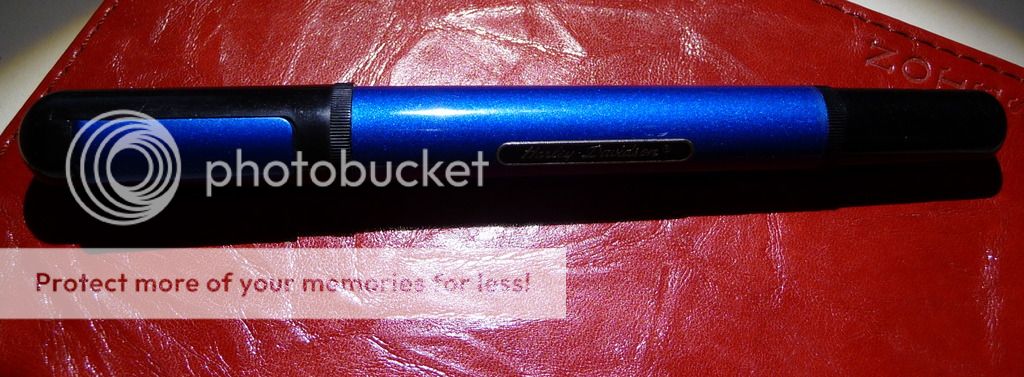
And here it is.

Most people who got demonstrators ordered a bakul (matte) finish with polished ends. I ordered bakul throughout. Hm. I wasn't so sure about that choice when it arrived. I looked at pictures of people's pens with polished ends and thought they looked so much nicer than what I'd got.
So far, so unconvinced... but then I put the pen in my hand. Oh, it felt good. Comfortable, just the right size, with a long and slightly curved section, the threads a long way up and out of my fingers' way. The curves of the bamboo pattern fitting nicely into the web of my hand. Light, warm, suited. My hands were convinced even if my eyes weren't.
I love the bakul surface. It looks misty and mysterious, particularly when the pen is inked; it's a network of tiny scratches, and has an organic feel to it which seems to go particularly well with the bamboo idea. It's really nice to hold, on the section; not slippery, and not rough, either, just gently keeping my fingertips in place.
The workmanship is good. The curves of the bamboo are nicely regular, the tiny indented rings between the nodes are precise, the gently conical ends have lovely snowflakes of bakul if you look closely, and you can't even see where the barrel and cap fit together once it's properly closed. The threading is precise, and in line with Indian eyedropper usage, fairly deep - several full turns to take the cap off.
(One small gripe; there's a little swarf around the breather hole in the cap. I might just want to clean that up as I seem to get my fingers right on it every time I cap or uncap the pen.)
Better fill it up, then. It came in a nice little turquoise-lidded box, which inspired me to break out the Diamine Havasu Turquoise. Careful eyedroppering (keeping a watchful eye on the apparently sleeping cat on the chair next to mine... she's already spilled coffee all over the table), feeling confident in the well threaded section and the silicon grease already applied...
And here we go with the Ambitious Flex nib, a new direction for me. It's totally plain - nothing written on it anywhere, just the single slit all the way up the nib - and I like that aesthetic. Applied to paper, it will flex, about twice the width without pressing unduly, but I've found I can also use it to write without any flex at all, just as a medium fine nib. It's nice. Just occasionally it's dried up for a couple of downstrokes (but then I've been using it on rather bad paper, because that's what's at hand and I have my tax return to finish). Generally, the feed seems to keep up with it pretty well.
(Ranga Pens included the 'regular' nib and feed in my package as well as the Ambitious nib in the pen. I appreciate that. I might want to swap - then again, I might have another pen that needs it. In fact, the total package, with an eyedropper, and a little Fellowship pen as a gift, was really nicely put together. Compare certain pen manufacturers that sell you a nearly £100 pen and don't bother to include a converter, and you'll see why I love Indian pens. Not just good value - good service too.)
So, a few pages later on.... I'm really enjoying the pen. And as I use it, I'm beginning to come to like its looks, as well.
It makes me wonder: how much is our attitude to a pen affected by our experience of holding it and writing with it? and how much just by looks? Is it love at first sight, or do most of us come to find our favourite pens by a long period of acquaintance, getting to know their virtues, their oddities, their occasional vices? And it's obvious from the number of very nice, hardly used pens for sale on FPN and FPGeeks that people do fall out of love (or never fall in love in the first place) with pens that they thought were a match made in heaven.
Anyway, my Ranga Bamboo is staying - and joining my collection of much loved Indian pens.
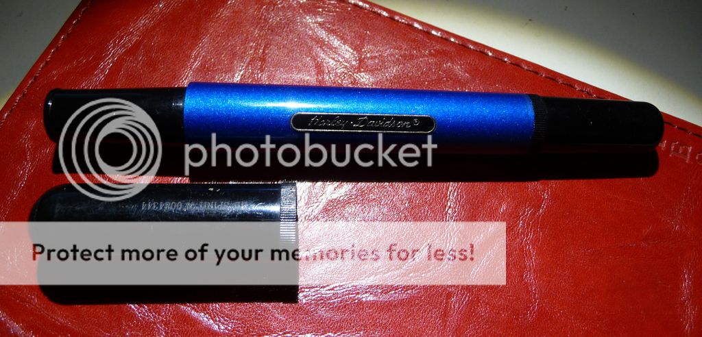