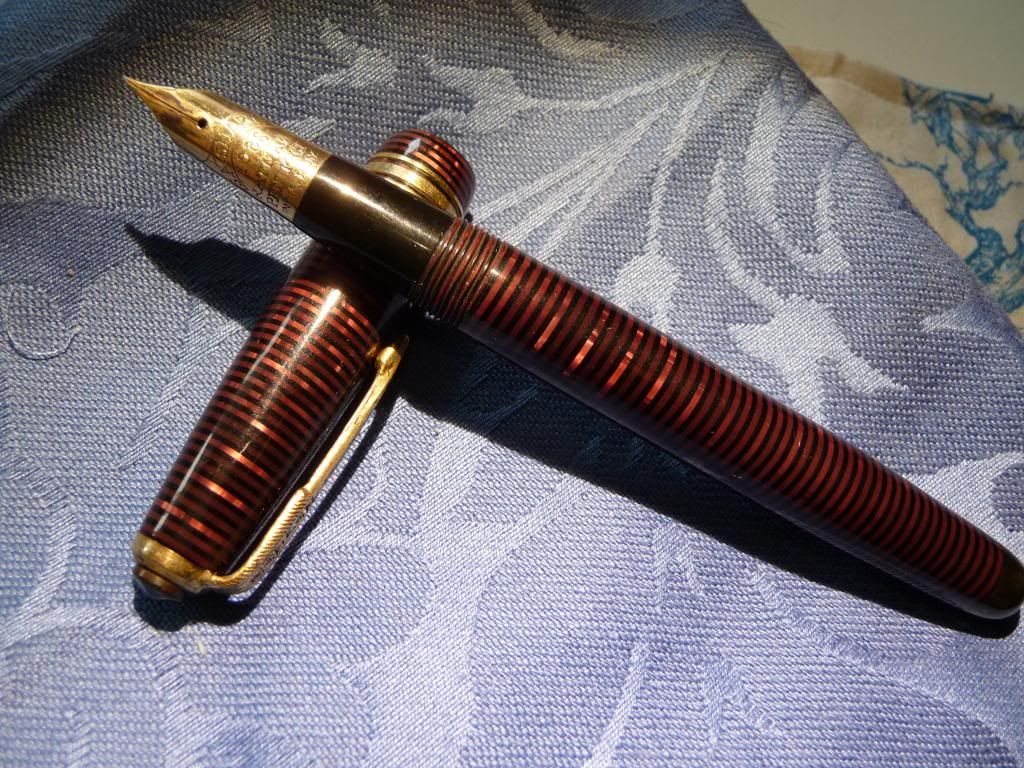
I love ebonite. It's a wonderful material. I particularly love those pens that are sometimes called 'woodgrain', with mottled red and black ebonite - in fact I've several times been sold a vintage Waterman or Bayard at a car boot sales as an interesting "wooden pen". While vintage pens often look faded and dull (and the black is often faded to a sort of olive green or brown), once they're polished they gleam beautifully, with the kind of soft glow you get from well polished wood.
Ebonite weighs right in the hand, too. Some plastic (acrylic, precious resin, lucite) pens feel just a little too light to me. Ebonite never does.
Ebonite is basically rubber, treated with heat and chemicals; it's plastic avant la lettre. It was what they made pens of up until the 1920s, when the advent of celluloid with its translucent patterns and brilliant colours changed the industry overnight. (Later on celluloid was replaced in its turn by plastics such as lucite.) If you collect pens you get into the whole business of acronyms - BHR, CBHR, and so on. (For the non-initiate, black hard rubber - that meaning ebonite - and chased black hard rubber - with patterns engraved on it.)
Problem. Unless you buy breakers or have lucky finds in junk shops, or grab third tier stuff, vintage ebonite will cost you dearly. Onoto and Waterman black ebonite pens for instance are quite dear - I particularly love the very slender lines of the early, straight pens, which have a sort of reverse bling to them, utterly austere and functional but their huge gleaming gold nibs a single point of focus - and if you want to collect early Waterman 'ripples', you will need a job at Goldman Sachs or a wealthy sugar daddy.
Then there are modern ebonite pens by manufacturers such as Bexley, Platinum,and Edison. The Platinum is over $600. Again, expensive. (I won't say ridiculously expensive, because Platinum are fantastic pens. But beyond my means, other than for a 'grail pen'. And I think a Hakase is on my list first.) The Edison, I have to say, is affordable, and a good pen at the price. But generally, modern ebonite comes dear.*
(Ebonite was still being used for some pens much later than the 1920s. But those pens, for me, don't have such a great appeal.)
Fortunately, several manufacturers in India are still producing ebonite pens, and I've had the opportunity to collect several during my travels. I even managed to locate some vintage ones for the exorbitant sum of 90 rupees each (about £1) in a stationer's shop in Vidisha, MP. Those are rather small ones. The modern pens are bigger - Guider and Ranga make jumbo pens if you want a really huge one - but in many other ways adhere to vintage design, with the torpedo/cigar being the most common. (I wish there were more flat-tops.)
Fountain Pen Network's classified section is also a good place to trawl for modern Indian ebonite. I've acquired some Deccans and Ratnams from there; I haven't yet visited Hyderabad or had a chance to visit the Tamil pen-makers. On another trip perhaps.
The one weak spot with Indian pens is the nibs. First, you won't get broad and italic nibs - the Indian market is one for fine nibs, generally. And secondly, you'll quite often get the sort of steel nib where the point is made by folding the steel over, rather than being tipped with iridium. Those can be quite scratchy. And thirdly, India is not Japan. There are no nibmeisters making Cross Emperors or grinding customised nibs for you.
There are ways round that. Many of the manufacturers now offer German nibs (Bock or Jowo) or can accommodate them. And because the pens are hand made, you can even send a nib you want a pen made for; I haven't done this, but I know people who have.
There's another thing to note, which could be a dealbreaker for some. These pens are nearly all eyedroppers. Now that can be a plus. The larger pens will take a truly impressive amount of ink! But you also get the regular eyedropper problems; burping when getting towards three-quarters empty, NSIP (Not Safe In Pocket), and a filling process that isn't quite as easy as sticking your favourite piston-filler in a pot and letting it slurp. Personally, I don't mind.
So: Indian ebonites. A cheap way to collect ebonite pens. But also a marvellous insight into Indian life, and a way to support small businesses in the subcontinent...The human aspect of my collecting has been a wonderful surprise; pen shops like Fountain Pen Hospital in Calcutta, Apsara Pens in Mumbai, and Pen & Co in Varanasi, manufacturers like Astra, who let me visit their factory, collectors and users of fountain pens, have all impressed me with their enthusiasm and friendliness. India can be a difficult country for westerners to get to know, but my entrée to this little subculture gave me many happy days and not a few friends.
* One big exception to the 'modern ebonite comes dear' rule is the Noodler Konrad, in ebonite. I don't have one - though my experience of the Ahab and Nib Creaper has been that they're fun pens, but a bit like 2CVs - fun to drive, but you have to do a lot of minor fixes, which fortunately they're designed for you to be able to do.
Ebonite weighs right in the hand, too. Some plastic (acrylic, precious resin, lucite) pens feel just a little too light to me. Ebonite never does.
Ebonite is basically rubber, treated with heat and chemicals; it's plastic avant la lettre. It was what they made pens of up until the 1920s, when the advent of celluloid with its translucent patterns and brilliant colours changed the industry overnight. (Later on celluloid was replaced in its turn by plastics such as lucite.) If you collect pens you get into the whole business of acronyms - BHR, CBHR, and so on. (For the non-initiate, black hard rubber - that meaning ebonite - and chased black hard rubber - with patterns engraved on it.)
Problem. Unless you buy breakers or have lucky finds in junk shops, or grab third tier stuff, vintage ebonite will cost you dearly. Onoto and Waterman black ebonite pens for instance are quite dear - I particularly love the very slender lines of the early, straight pens, which have a sort of reverse bling to them, utterly austere and functional but their huge gleaming gold nibs a single point of focus - and if you want to collect early Waterman 'ripples', you will need a job at Goldman Sachs or a wealthy sugar daddy.
Then there are modern ebonite pens by manufacturers such as Bexley, Platinum,and Edison. The Platinum is over $600. Again, expensive. (I won't say ridiculously expensive, because Platinum are fantastic pens. But beyond my means, other than for a 'grail pen'. And I think a Hakase is on my list first.) The Edison, I have to say, is affordable, and a good pen at the price. But generally, modern ebonite comes dear.*
(Ebonite was still being used for some pens much later than the 1920s. But those pens, for me, don't have such a great appeal.)
Fortunately, several manufacturers in India are still producing ebonite pens, and I've had the opportunity to collect several during my travels. I even managed to locate some vintage ones for the exorbitant sum of 90 rupees each (about £1) in a stationer's shop in Vidisha, MP. Those are rather small ones. The modern pens are bigger - Guider and Ranga make jumbo pens if you want a really huge one - but in many other ways adhere to vintage design, with the torpedo/cigar being the most common. (I wish there were more flat-tops.)
 |
| Vintage ebonite pens - one has a Parker-style arrow clip |
Fountain Pen Network's classified section is also a good place to trawl for modern Indian ebonite. I've acquired some Deccans and Ratnams from there; I haven't yet visited Hyderabad or had a chance to visit the Tamil pen-makers. On another trip perhaps.
- Deccan I love very much. These pens are classics, beautifully made and enjoyable to use. Deccan is the Lamy of Indian pens - I'm sure they would be surprised to be described that way, but they seem to love monochromatic designs, in brushed black (ebonite-pretends-to-be-Makrolon) or a wonderfully warm white (but that's not ebonite, to be fair). I have two in brushed ebonite; just lovely. You can get the other ebonite varieties too... but the black seems, somehow, their forte.
- Guider make classical ebonites. I have three matching pens, in black, brown, green - the 'traffic lights' colours of Indian ebonite.Very satisfying. I think I paid about £4 each for these pens, in a tiny, cluttered pen shop in the wholesale market in Mumbai.

Guider pens - Ranga (also sold as Varuna by Andy's Pens in the UK) seems to have the widest range of colours, including a yellow ebonite that's fairly mustardy - I must see if they can get a Colman's Mustard ripple, red and yellow, that would be really something! - as well as lighter blues and greens, and three-colour mixes. I'm not sure I love all of them equally; there's something about the standard two-colour marbling that is both austere and rich at the same time, the classic look, and the multicolours don't have that classic feel. But I do like their 'bamboo' pens. I think Ranga has the most extensive and adventurous range. Times of India had an interesting article on them. I must visit!
- Astra in Aurangabad makes ebonite pens of some distinction. You can only get these from Abhay Pens in the same city, its sister business, as it turns out, so I'm rather glad I had time to kill before taking the night bus for Ahmedabad. I particularly like the light fawn ripple. This business seems to have access to some very nicely rippled ebonite - these pens have a far bolder pattern than most Indian pens, though some of that may be down to my selection. (The ripple patterns of cap and pen don't always match. But I was allowed to swap a couple of caps around in the shop. These pens are machined, not hand-made, so you can do that.)

Wonderful ripples from Aurangabad - Ratnam and Ratnamson are, as the names suggest, related. I have a couple of each.
- Kim & Co of Kozhikode make good looking ebonites, but I don't have one - yet.
The one weak spot with Indian pens is the nibs. First, you won't get broad and italic nibs - the Indian market is one for fine nibs, generally. And secondly, you'll quite often get the sort of steel nib where the point is made by folding the steel over, rather than being tipped with iridium. Those can be quite scratchy. And thirdly, India is not Japan. There are no nibmeisters making Cross Emperors or grinding customised nibs for you.
There are ways round that. Many of the manufacturers now offer German nibs (Bock or Jowo) or can accommodate them. And because the pens are hand made, you can even send a nib you want a pen made for; I haven't done this, but I know people who have.
There's another thing to note, which could be a dealbreaker for some. These pens are nearly all eyedroppers. Now that can be a plus. The larger pens will take a truly impressive amount of ink! But you also get the regular eyedropper problems; burping when getting towards three-quarters empty, NSIP (Not Safe In Pocket), and a filling process that isn't quite as easy as sticking your favourite piston-filler in a pot and letting it slurp. Personally, I don't mind.
So: Indian ebonites. A cheap way to collect ebonite pens. But also a marvellous insight into Indian life, and a way to support small businesses in the subcontinent...The human aspect of my collecting has been a wonderful surprise; pen shops like Fountain Pen Hospital in Calcutta, Apsara Pens in Mumbai, and Pen & Co in Varanasi, manufacturers like Astra, who let me visit their factory, collectors and users of fountain pens, have all impressed me with their enthusiasm and friendliness. India can be a difficult country for westerners to get to know, but my entrée to this little subculture gave me many happy days and not a few friends.
* One big exception to the 'modern ebonite comes dear' rule is the Noodler Konrad, in ebonite. I don't have one - though my experience of the Ahab and Nib Creaper has been that they're fun pens, but a bit like 2CVs - fun to drive, but you have to do a lot of minor fixes, which fortunately they're designed for you to be able to do.