Friday, 6 June 2014

Why I loathe the Wyvern 303

Fountain pen aesthetics are funny things. Some people love the MB 149, some find it boring. Some people love Chinese bling pens, as much abalone and gold plate and shiny glittery blingy razzmatazz as you can load on a five inch stick, other hate them.

Me, I loathe the Wyvern 303.

Actually from the outside, this pen doesn't look bad. It looks a bit like some of the Waterman Taperite, Crusader, Dauntless, Garland - well, most, like the Taperite Citation, with its great big cap band. That's really striking, and I rather like it. The torpedo shape and the simple clip are classical. I could quite like this pen, which is why when I saw one on a stall at a London antiques market, I took a closer look.

But as soon as I took the cap off - oh, yuk.

I don't like pens with convex sections, for a start. A section should either be straight, or concave, that is, gently flared, or it should have a lip, like the early Parker Duofolds, to prevent your fingers sliding into the inky zone or off the pen completely. Convex section - wrong. And though it has a little rolled lip, it's so small that it's completely useless.

I don't like meanness. The Wyvern 303 is not a small pen, but it has a itsy bitsy teeny weeny absolutely bloody minuscule nib. Just economising on the amount of gold. Such a big, positive, butch pen, and when it comes to the business end ... I know they say "size isn't important", but in this case it is. Or as Horace says, Parturient montes, nascetur ridiculus mus. (JFGI.) This is a Superman pen with a Walter Mitty nib.

And then that step between the section and the barrel. No need for that at all in a torpedo shaped pen with a metal cap. Look at the Parker 51 - smooth, smooth lines hardly disturbed by the gleam of the clutch ring. Waterman Taperite - stubbier, less elegant, but still with those smooth lines. ~Aerodynamic, streamlined, modern, like a decent sports car. The 303_ Oh dear. Wants to be a Jaguar and ends up more of a Trabant.

Which is why I hastily put the pen back without enquiring about its price. Even for a quid, I didn't want it. I positively loathed it. And that's why there's no photo on this blog post, though if you want to see a picture, I can point you to a post on that excellent blog, Goodwriterspens


Tuesday, 3 June 2014

A pair of oddities

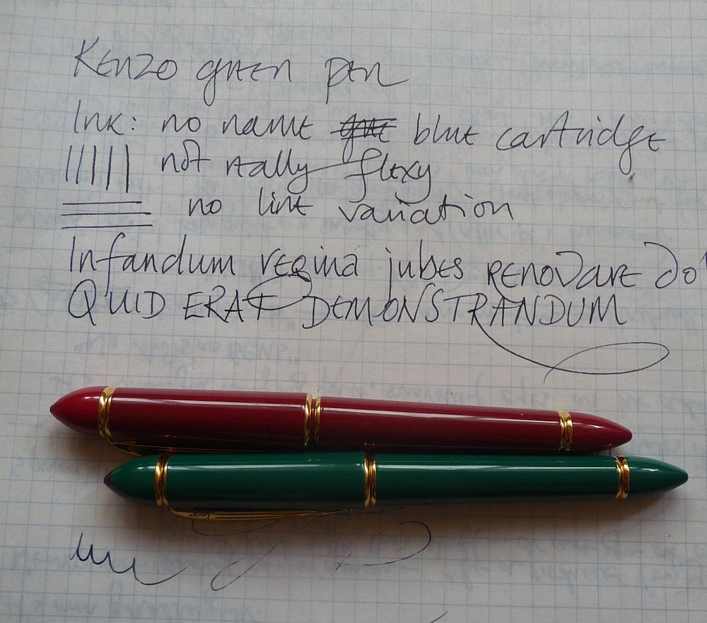
I recently managed to acquire a pair of oddities at a car boot sale. They're two Kenzo fountain pens, one in red and one in green,both with gold trim. They're quite charming pens, fairly slim but not too small (13cm in length), and apparently dating from the early 1990s, made for the Kenzo fashion house. My experience has been that most fountain pens made for fashion brands aren't terribly good, but in this case I was surprised to find I'd acquired a pair of decent writers. (According to GoPens they were made for Kenzo by Stypen. I have a few reliable and nicely made Stypens, so that's perhaps not as much of a surprise as it could be.)

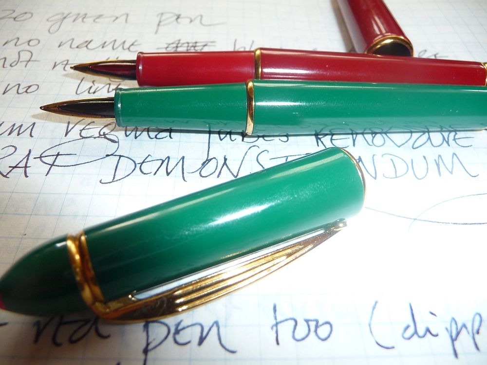
The design is a little quirky. The rings at the top of the cap and end of the barrel are indented, and there's also an indent in the cap ring and section ring, breaking up the contour of the pen. The ends are quite pointed, and there's a red transparent jewel at the top of the cap.

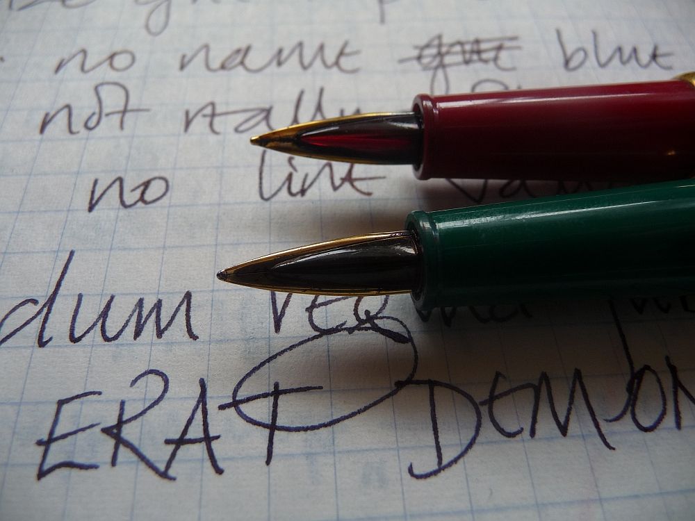
Open up the pen and you see its most notable oddness - a jewelled overfeed. The red pen has a glowing red overfeed, but that on the green pen is darker (it appears to be the same red, but discoloured by ink), and this has caused me a few problems as I have to look quite closely to see which way up I've got the nib. The true feed is also elongated and quite plain, though a little larger than the overfeed.

The section is very slender, tapering down to 7mm. I don't have any problem writing with it though. And though the pen's relatively heavy for its size, due to the (I think) brass construction under lacquer, I can write continuously for some time without my hand becoming tired.


I'm not sure the red jewel goes with the green. It's the one thing that spoils my pleasure in that pen. It's a bit sinister, like a crocodile with bloodshot eyes or a green idol with ruby eyes... if Cthulhu had a pen, this would be it.

And on one level I suppose I do find the design rather hideous. But then a lot of the things in my wardrobe in the early 90s were equally hideous. (A search for 'Kenzo 1990s' found a remarkable purple and green paisley suit... which, objectively, was rather lovely, but not very street cred. I think it will take a while for this decade to come back in fashion.) It's certainly original. This pen doesn't look like anything else I've got. It doesn't look like a knockoff of a Duofold, a Montblanc 149, a Faber Castell Ambition or a Lamy Safari. It looks unique.

The surprise for me was that these designer label pens are truly delightful writers. The nibs don't flex but they have a bit of bounce, a little softness that makes writing with them easy and extremely smooth. No scratchiness at all, unless I turn them over by mistake or by design, in which case they still write, but a thinner line, and with a bit too much feedback. I wonder if these are actually gold nibs? They certainly write as if they are.

I understand these pens are also available in yellow, black (or possibly dark blue) and fuchsia (unless that's just someone's way of describing the red) - all, oddly, with the red jewel. I'd love to put together the whole collection.


Tuesday, 15 April 2014

Hero 325: a Chinese cheapie that works

Chinese pens - love 'em or hate 'em?

Well, I have to say I'm not a lover of the heavy machined brass pens we often see on eBay. Particularly not when they have thin lacquer pretending to be celluloid, which starts flaking off after a couple of months' use. I'm not a lover of fake Montblancs - the real thing has far too much bling for my likeing anyway - and the nibs are never anything special.

Add to which that it's the Japanese who make really good cheap pens - the Pilot 78g for instance, which can be found with a formidable broad nib if you look in the right places.

But I have a Hero 325, a little flighter that I picked up in a stationery shop in Bhopal, and I'm rather pleased with it. It's very light, very streamlined, with an extremely simple clip, metal tassies at each end, and a black plastic section - more slender than the P51 and without any clutch ring to disturb the extremely plain look of the pen.

I was slightly surprised to find it such a simple pen. Really, no Chinese bling nonsense. No dragons, horses, extra bits of glitter. It's a slender pen too; not quite 14 cm long, but only 9mm round, whereas my Jinhaos are much chubbier (and heavier).

What really surprised me, though, was the ease of writing with the little hooded nib. I haven't tweaked it a bit. It gives a little feedback but it's not scratchy, and it writes nice and wetly with Cross black ink.(None of your fancy Iroshizuku cherry blossom viewing ink here - cheap pen, cheap ink, functional stuff.) It's springy enough to be pleasant, and writes fast when I'm taking notes without skipping at all. No hard starts either. I've had pens I paid many times more for that aren't half as much fun.

The weak point? A squeeze filler that doesn't seem to draw in much ink and feels very cheap indeed compared to the P51 aerometric filler (a piece of engineering that is really top class).

I have no idea whether all Hero 325s are as nice. I hear that Hero has quality problems. But if this is the usual standard of their pens, I'd be happy buying another one.

Thursday, 27 March 2014

Bring me my pen, would you, Oldchap!

How could you not love a pen called Old Chap! (or Oldchap, strictly, without the space). It sounds as if it wears a tweed suit and a pair of brogues, and has an addiction to stiff upper lip and the art of understatement.

In fact, it's a French brand, so it would say 'litote' and not 'understatement'. And certainly the accommodation clip on this pen is anything but understated. It's in that rather overdone French art-nouveau meets Cthulhu vein that I'm never quite sure whether I love or hate. (Hate, probably.)

And here it is, photographed together with a Waterman Inkvue, because the material is almost, not quite, the same celluloid, with striking 'x-rays' in black and marbled grey (the Waterman is green). The effect of iridescence in the coloured rays is lovely. (Not so the brassing of the cap rings.) Its measurements are 12.3 cm long capped, 11.5 cm uncapped - just a bit shorter than the Waterman.


inkvueandoldchap1.jpg

The ends of the pen, and the section, appear to be in ebonite which has gone somewhat olive. I removed the accommodation clip to see if originally the Oldchap had a different clip which had broken or been removed, but there's no sign that there was every anything there. 


inkvueandoldchap5.jpg
The Oldchap is a lever filler. The lever is rather boring, particularly compared to the beautifully precise lever box and articulated lever of the Waterman. But it's well made, the end slightly bent to recess it into the shallow scooped end of the slot. There's no imprint  anywhere on the barrel. And this is a traditional lever filler, as far as I can see, with a traditional lever, not trying any of the advanced engineering tricks of the Inkvue with its lever-actuated bulb-filling mechanism and backwards-fitted lever.

inkvueandoldchap3.jpg
Now, as for the nib. It's quite big - nearly 22mm long, almost exactly the same length as the Waterman, as it turns out, but a good bit wider. 18 carats, which is correct for a French made pen (14 carats/585 didn't qualify as 'or massif' according to the French assay regulations, so I'm told). And on dipping it I find that it writes, quite fine, and with a little flex. A little bit of feedback when I flex it hard, otherwise, it's quite smooth. 

inkvueandoldchapnibs.jpg

I'm really quite impressed by this pen. It's a stunning looking beast, nicely made, and now sits in a box together with the Ink-Vue looking, if not quite a million dollars, at least worthy of its companion pen. I will be looking out for moreof the same: Tally-Ho, Oldchaps!


Wednesday, 12 February 2014

In praise of Indian ebonite

I love ebonite. It's a wonderful material. I particularly love those pens that are sometimes called 'woodgrain', with mottled red and black ebonite - in fact I've several times been sold a vintage Waterman or Bayard at a car boot sales as an interesting "wooden pen". While vintage pens often look faded and dull (and the black is often faded to a sort of olive green or brown), once they're polished they gleam beautifully, with the kind of soft glow you get from well polished wood.

Ebonite weighs right in the hand, too. Some plastic (acrylic, precious resin, lucite) pens feel just a little too light to me. Ebonite never does.

Ebonite is basically rubber, treated with heat and chemicals; it's plastic avant la lettre. It was what they made pens of up until the 1920s, when the advent of celluloid with its translucent patterns and brilliant colours changed the industry overnight. (Later on celluloid was replaced in its turn by plastics such as lucite.) If you collect pens you get into the whole business of acronyms - BHR, CBHR, and so on. (For the non-initiate, black hard rubber - that meaning ebonite - and chased black hard rubber - with patterns engraved on it.)

Problem. Unless you buy breakers or have lucky finds in junk shops, or grab third tier stuff, vintage ebonite will cost you dearly. Onoto and Waterman black ebonite pens for instance are quite dear - I particularly love the very slender lines of the early, straight pens, which have a sort of reverse bling to them, utterly austere and functional but their huge gleaming gold nibs a single point of focus - and if you want to collect early Waterman 'ripples', you will need a job at Goldman Sachs or a wealthy sugar daddy.

Then there are modern ebonite pens by manufacturers such as Bexley, Platinum,and Edison. The Platinum is over $600. Again, expensive. (I won't say ridiculously expensive, because Platinum are fantastic pens. But beyond my means, other than for a 'grail pen'. And I think a Hakase is on my list first.) The Edison, I have to say, is affordable, and a good pen at the price. But generally, modern ebonite comes dear.*

(Ebonite was still being used for some pens much later than the 1920s. But those pens, for me, don't have such a great appeal.)

Fortunately, several manufacturers in India are still producing ebonite pens, and I've had the opportunity to collect several during my travels. I even managed to locate some vintage ones for the exorbitant sum of 90 rupees each (about £1) in a stationer's shop in Vidisha, MP. Those are rather small ones. The modern pens are bigger - Guider and Ranga make jumbo pens if you want a really huge one - but in many other ways adhere to vintage design, with the torpedo/cigar being the most common. (I wish there were more flat-tops.)
Vintage ebonite pens - one has a Parker-style arrow clip

Fountain Pen Network's classified section is also a good place to trawl for modern Indian ebonite. I've acquired some Deccans and Ratnams from there; I haven't yet visited Hyderabad or had a chance to visit the Tamil pen-makers. On another trip perhaps.

  • Deccan I love very much. These pens are classics, beautifully made and enjoyable to use. Deccan is the Lamy of Indian pens - I'm sure they would be surprised to be described that way, but they seem to love monochromatic designs, in brushed black (ebonite-pretends-to-be-Makrolon) or a wonderfully warm white (but that's not ebonite, to be fair). I have two in brushed ebonite; just lovely. You can get the other ebonite varieties too... but the black seems, somehow, their forte.
  • Guider make classical ebonites. I have three matching pens, in black, brown, green - the 'traffic lights' colours of Indian ebonite.Very satisfying. I think I paid about £4 each for these pens, in a tiny, cluttered pen shop in the wholesale market in Mumbai.
    Guider pens
  • Ranga (also sold as Varuna by Andy's Pens in the UK) seems to have the widest range of colours, including a yellow ebonite that's fairly mustardy - I must see if they can get a Colman's Mustard ripple, red and yellow, that would be really something! - as well as lighter blues and greens, and three-colour mixes. I'm not sure I love all of them equally; there's something about the standard two-colour marbling that is both austere and rich at the same time, the classic look, and the multicolours don't have that classic feel. But I do like their 'bamboo' pens. I think Ranga has the most extensive and adventurous range. Times of India had an interesting article on them. I must visit!
  • Astra in Aurangabad makes ebonite pens of some distinction. You can only get these from Abhay Pens in the same city, its sister business, as it turns out, so I'm rather glad I had time to kill before taking the night bus for Ahmedabad. I particularly like the light fawn ripple. This business seems to have access to some very nicely rippled ebonite - these pens have a far bolder pattern than most Indian pens, though some of that may be down to my selection. (The ripple patterns of cap and pen don't always match. But I was allowed to swap a couple of caps around in the shop. These pens are machined, not hand-made, so you can do that.)
    Wonderful ripples from Aurangabad
  • Ratnam and Ratnamson are, as the names suggest, related. I have a couple of each.
  • Kim & Co of Kozhikode make good looking ebonites, but I don't have one - yet.
I'm sure I have missed some manufacturers out. Please correct me!

 The one weak spot with Indian pens is the nibs. First, you won't get broad and italic nibs - the Indian market is one for fine nibs, generally. And secondly, you'll quite often get the sort of steel nib where the point is made by folding the steel over, rather than being tipped with iridium. Those can be quite scratchy. And thirdly, India is not Japan. There are no nibmeisters making Cross Emperors or grinding customised nibs for you.

There are ways round that. Many of the manufacturers now offer German nibs (Bock or Jowo) or can accommodate them. And because the pens are hand made, you can even send a nib you want a pen made for; I haven't done this, but I know people who have.

 There's another thing to note, which could be a dealbreaker for some. These pens are nearly all eyedroppers. Now that can be a plus. The larger pens will take a truly impressive amount of ink! But you also get the regular eyedropper problems; burping when getting towards three-quarters empty, NSIP (Not Safe In Pocket), and a filling process that isn't quite as easy as sticking your favourite piston-filler in a pot and letting it slurp. Personally, I don't mind.

So: Indian ebonites. A cheap way to collect ebonite pens. But also a marvellous insight into Indian life, and a way to support small businesses in the subcontinent...The human aspect of my collecting has been a wonderful surprise; pen shops like Fountain Pen Hospital in Calcutta, Apsara Pens in Mumbai, and Pen & Co in Varanasi, manufacturers like Astra, who let me visit their factory, collectors and users of fountain pens, have all impressed me with their enthusiasm and friendliness. India can be a difficult country for westerners to get to know, but my entrée to this little subculture gave me many happy days and not a few friends.


* One big exception to the 'modern ebonite comes dear' rule is the Noodler Konrad, in ebonite. I don't have one - though my experience of the Ahab and Nib Creaper has been that they're fun pens, but a bit like 2CVs - fun to drive, but you have to do a lot of minor fixes, which fortunately they're designed for you to be able to do.

Tuesday, 28 January 2014

Kaweco sport luxury variants

I was amazed when I looked closely at my black-and-white (think a fountain pen made out of Licorice Allsort) Kaweco Sport Art that it actually does have a gold nib. I thought they all came with gold plated steel, but this one clearly states 14k / 585. That got me doing a little bit of work to find out the history of the luxury variants of the Sport.

The Sport itself, by the way, was first issued in its modern form in 1934. Kaweco closed down in 1980, and the 'new' Kaweco company opened for business in 1995 with a range of Sports in 'outdoors' colours - camouflage grey-green, brown and dark blue. Brighter Sports followed the year after, but it wasn't till 2000 that Kaweco decided to produce a luxury version.

In 2000, Visconti made a limited edition of green celluloid Sports for Kaweco. Only 883 were made, which means I may never get my hands on one of these delightful gold-nibbed pens. (They combine Italian wickedly glowing celluloid with Germanic austerity of form, which hits two of my fountain pen sweet spots bang on. A bit like the glowing red Lamy 2000 auctioned a while back - Bauhaus, but in vivid colour!) And it's a piston-filler, too.

My black-and-white Sport's proper name is the Tango, and it was part of a four pen range that included also the Blues, Samba (purple and dark indigo), and Mamba (gold and brown marbling), issued in 2003 with the intention of bringing in new colours every two or three years. The pens were turned, not injection moulded like the basic range, and the colourful acrylics really make a splash.

I haven't found out when the current Sport Art range was first produced. These are:
  • Amber
  • Amethyst
  • Lapis lazuli
  • Amecitrin - a lovely yellow
  • Aksehir - black and white, with Arab-calligraphy style loops
  • Alabaster - pearly white
  • Granit - white and grey, with an interesting ghost-like effect of grey showthrough
  • Rosit - bright pinkish red, with soft stripes of two slightly different hues
Again, they are produced by turning from solid acrylic. The amber, amethyst and lapis are perhaps the most stunning, with their transparency and glittering effect, but I rather want to get my hands on an Aksehir, for the striking pattern.

I make that twelve pens to collect, if I stick only to the fountain pens, and excluding the Visconti version. Four down so far!

Martini Auctions sometimes have interesting prototypes of different Sport versions. At the moment there are some with silver pens and coloured caps; I must admit, they're not my favourites.

Sweet Joy befall thee!

Lamy Joy.
Photo from Lamy Twothousand on Flickr. I only have the black and red one.

What a beauty this pen is. Sleek shiny black. Cylindrical top. Tapered barrel.

Accents in red. Big red paperclip clip. Red disk closing the cap. Tiny red insert right at the end of the barrel, neatly balancing the clip.

Simple geometrical forms. Cylinder cap. Triangle section. Triangular nib. Flattened cone taper. An elegant oscillation between rounded and flat, circles and angles.

At work; 1.5mm of sharp italic, flowing wet.A section that feels as if it's part of my hand.

Doesn't post. Obviously.

Practicalities. Nibs swap in, swap out. £7 or so for a new one. Swaps with Safari and Vista. Swaps with Studio, Al-Star, Accent, CP-1, Logo. Up to 1.9mm, down to extra fine.

This is a lot of joy.