Wednesday, 18 November 2015

My Lady Frankenpen

A set of pens that intrigue me, and of which I have a small but growing collection, is the Waterman 'Lady' series. These sweet little handbag pens are all based on the same model, a tubular body - if you shrank a Laureate and took the clip off, you'd be most of the way there - but with different materials and finishes.

Two of these pens particularly delight me because Waterman under its visionary CEO Francine Gomez took the unusual step of making them from vintage galalith. The Lady Agathe is the upmarket one, and came in its own little tubular carrying case made of the same material as the pen, with a gold nib; the Lady Elsa is a little less splendid, and came in a leather pouch, with a gold plated steel nib.

Then there's the Lady Alice, in gold or silver plate; the Lady Charlotte, in lacquer finish (some in a delightful eggshell crazed pattern); the Lady Patricia, a metal pen with a carved chequerboard finish; and the Lady Anastasia, which has a printed little baroque cartouche reminiscent of St Petersburg's golden age on the cap (there's also the 'Reve Latin' version which has a more southern influence).

The Anastasia is very recognisable, so when I saw a royal blue cap in a box of junk at a car boot I was quite excited. The excitement didn't last - the cap was all there was left of the pen, with a section firmly gummed into the cap so I couldn't see whether it had a nib or not. Still, the price demanded (20 euro cents) seemed more than fair, so off I went.
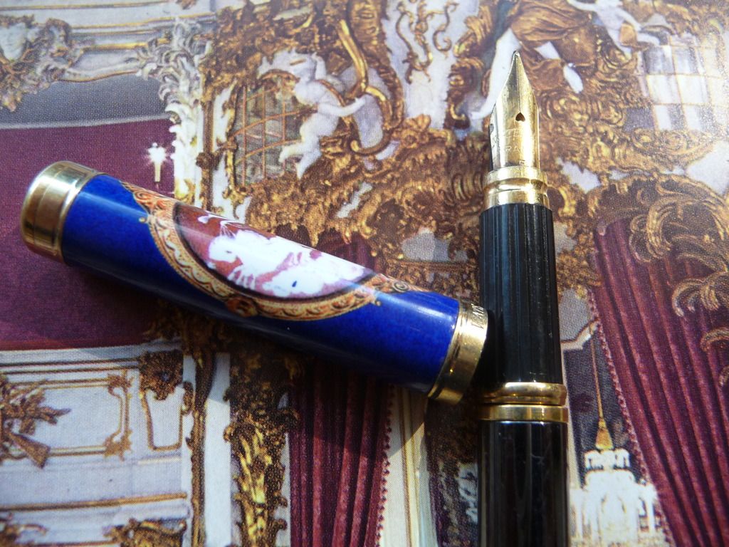
Baroque beauty
Now, one of the great things about modern Watermans is that many of the components are interchangeable. Nibs often fit more than one pen, so I thought I had a reasonable chance of finding a barrel that would fit, either in my parts box or as a temporary fix borrowing from another pen.

I've picked up quite a few modern Watermans at sales, and I had a Laureate rollerball in gunmetal that has a slimmer body than the fountain pens in that range. I tried it. Hurrah! It worked! At least that sorted out the issue of how to get the section out of the cap, and showed that the pen had a gold plated steel nib, in perfect condition, and (if you look closely you can see it) with a heart-shaped breather hole. I rather like that - at the same time complementing the feminine nature of the pen, and providing a reference back to Waterman's early history.

The resulting pen is ugly - the colour clashes and the barrel is way too long for the pen - but I can use it, and the nib is a good little writer, like most Watermans of this era.
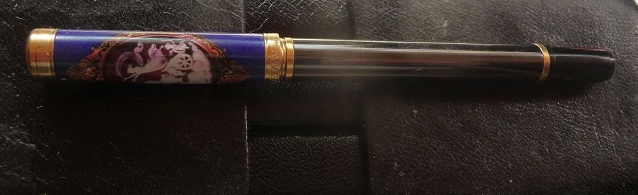
Ugly. Ugly. Ugly. But it works.


Flushed with my success, I now have another victim on my operating table: a Lady Patricia, bought without a nib, which is going to get a transplant from an Executive.

Friday, 13 November 2015

An Indian 'Duofold'

The golden age of the Indian fountain pen may just be beginning.

Four or five years ago, when I first got seriously interested in Indian pens, they were very much a minority interest. Chinese pens had a huge following, while Indian pens had very few lovers (or so it seemed). And the Indian pen industry was gradually being whittled away as manufacturers and retailers gave up on fountain pens in the age of the cheap ballpoint.

Now things are changing. A new generation of Indian fountain pen lovers has arrived, and with them new manufacturers - Fosfor and ASA Pens - together with a basic structure of e-commerce to support some of the smaller manufacturers. Ranga Pens is exporting, with Peyton Pens selling their products into the US, and there's a thriving Indian pen forum on Fountain Pen Network, through which I've been able to participate in three Group Buys (thanks to Vaibhav Mehandiratta and jjlax10.

The joy of ebonite! The tiger and the fire
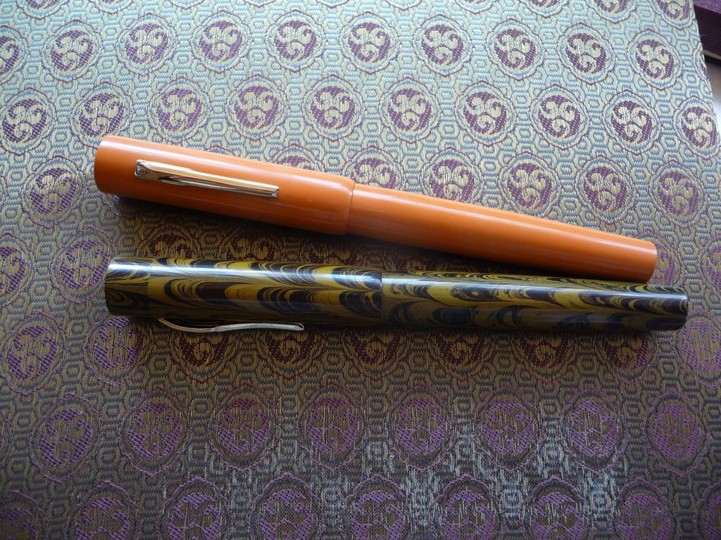
These two beauties arrived through one of the group buys - Ranga Model 3s. One is in brown and black ripple, a fairly conservative, though striking, combo, but the other is outrageous in premium orange ebonite. The colour in real life is a little more muted, towards terracotta rather than fluorescent orange, but it's still a pen that draws attention.

They're big pens - 148mm long, and girthy with it - but relatively light in the hand, as the only metal used on them is the nib and clip. Because there's no metal in the section, they're usable as eyedroppers, though I decided to get the version with converter at a slight premium to the pure ED model.

Despite their size, though, they are elegant pens, with a long, cylindrical cap and then a gentle swell in the barrel till it starts to taper away again towards the end. I particularly like the curved lip at the end of the cap, and the fact that there's no step between the barrel and the section. The clip is quite modern, simple, and elegant, and feels pretty rigid (all my pens are desk pens and never go in a pocket). If I have one quibble, it's that I find the lip at the end of the section just a tad too prominent and occasionally annoying if my fingers slip on to it.

The finish is very good. The pens are buffed to a nice polish, and the details are well turned. Lovers of the snap-on cap, though, should note that it takes a good few turns to twist the cap on and off, and the barrel to section threads are much deeper than on most C/C pens. These are pens for sitting at your desk and writing at some length; they're not for jotting down notes "as and when" .

I chose broad nibs with both pens, and eventually I'll probably have a go at grinding them to cursive italic. To my great delight they both wrote straight away - ten out of ten for "out of the box" performance, on which much more expensive pens often score poorly. The nibs are Jowo. (Better nib choice is one of the things that's changed in the Indian pen industry, which for a long time offered a choice of scratchy steel nibs or scratchy gold-plated steel nibs.)

I've christened the orange one 'Big Red' already. And I do have an original Parker Big Red - but this one's bigger if not redder! These may not be duofolds, but they are real classics - and you can get five or six of them for the price of a modern Parker Duofold.
Two Parkers and a Ranga. The little Parker is a mess, but I love it.

Parker and Ranga nibs and sections. Parker is much more gently flared and a lot shorter


Tuesday, 21 July 2015

My beautfiul Brahmam

This sweet ebonite eyedropper fountain pen from India just joined my collection. It fills a little gap, because although I have a good representation of pens from Indian manufacturers like Deccan, Ratnam, Ranga, Mohi, Airmail/Wality, and Guider, I was missing a Brahmam: the business stopped producing pens before I really got into the Indian pen scene.

I love this ebonite. A lot of modern Indian ebonite has quite busy patterns - very ornate swirls that remind me of peacock feathers or eighteenth century marbled paper. But this has a big, bold, diagonal stripe. If tigers wore jungle camouflage this is what they would look like.


The pen is nicely made. The arrow clip's feathers are well defined, the ebonite is polished to a high gloss, and the section has a really sharply cut lip and beautiful flare to it. The only blemish, to my taste anyway, is that I think the tassie has been left too proud, and should have been turned down another millimetre or so... but that's nitpicking. All in all, it's a nice pen, and it doesn't write badly either - a stiff nib which has just a little feedback, writing the fine side of medium or the broad side of fine, with no line variation, but ready and willing and not scratchy at all.


Like many Indian pens it shows influences from a couple of different sources - the nib looks like a Sheaffer with the scalloped line between two colours of metal (a bit of plating loss on the 'gold' section), but the cap and clip are definitely Parkerish. Neither Sheaffer nor Parker ever came out with this kind of ebonite, though!


Monday, 20 July 2015

What difference does an ink make? Lots!

I was a little bit disappointed with my recent purchase of a Platinum 3776 Nice. It's a lovely pen, but I fired it up with Herbin's Diabolo Menthe - one of my favourite greens - and it wrote like a dog. The medium nib was just too dry - it wasn't any fun to write with; it felt like the kind of biro that you have to push down into the paper, and the ink looked very faint when it did actually hit the paper.

So let's try again. Waterman Vert Harmonie.

This is a completely different pen! Ready and willing to leave a nice, fine-side-of-medium (as you'd expect from a Japanese pen) green line. It even blobbed on first use just to show me it had changed its spots. It's now a pleasure to use.

(Of course the paper you use also matters. With the Herbin ink, it hated my Rhodia, but wrote acceptably - only acceptably, still not a great pleasure to use - on regular computer printer paper.)

It's a good thing I found this out before I decided to go tweaking the nib!

Monday, 2 March 2015

Launching a new brand

How to do it - those Kaweco Sports!
It's been interesting to see a few new launches recently in the fountain pen world. Although the death of the fountain pen has often been announced (from the 1940s onwards!) and some of the old stalwarts have fallen by the wayside, that hasn't stopped new rivals entering the market.

Most recently, the Esterbrook name has been revived - not particularly successfully as far as the collecting community is concerned, since lovers of the vintage Esterbrook designs don't see the new pens as looking anything like the Esterbrook they love. It's actually a pity that this particular brand was chosen by Harpen to relaunch, because the Esterbrook J is absolutely iconic, with its shiny, shimmering celluloid and its bright colours.

Les Plumes de l'ange in Belgium offers nice looking pens, though nothing new; Manu Propria, relatively recently established by watchmaker Martin Pauli, offers fine urushi hand-made pens (I'm a huge fan of his Facebook posts - featuring not only his own work, but exhibitions of suiseki and bonsai). Then there are the various Kickstarter launches, including Karas Kustoms. There are also individual makers like Pierre Miller of Desiderata.

I'm not going to talk about the top of the market. I think different factors are at play there. But for a mid-market pen, say in the £20-80 range, what are the factors making for success?

  • Identity. One of the difficulties with the new Esterbrooks is that frankly they don't have that strong a character. They could quite easily sit among a collection of Monteverdes or perhaps Jinhaos and you wouldn't spot the difference. On the other hand, Karas Kustoms has a very strong branding - massive metal pens, angular, featuring an engineering-heavy design that is functional and butch. Desiderata - very simple shapes, in rich materials, particularly wood: again very recognisable.
  •  Offer me some proper functionality. Pierre has evolved his pens to address what everyone inside the fountain pen community knows is a yawning gap - the modern flex pen. That's the same idea as Noodler's with the Ahab, a pen that conquered copperplate writers' hearts (or at least some of them). Offer me a range of nibs including italic options, stubs, fine (TWSBI is good at this). Don't (and Esterbrook, this is you!) offer me a medium nib and no choice.
  • Don't be afraid of controversy! Noodlers and TWSBI are loved and hated in equal measure.But it's very clear what they stand for: user-tweakable pens, at a certain price point, with a certain style. (Incidentally, I wonder whether Noodlers' move up-market is the right way to go: the Konrad and Neponset are a lot more expensive than the Ahab and Creaper, and while Neponset does offer a music nib for quite a bit less than Platinum or Sailor, it's no longer cheap.) A successful brand is more likely to result if you strike out for a particular idea of what a pen should be - even if not everyone agrees with you.
  • Target your market. Yes, Cross and Parker do well out of the corporate market and stationery shops. If you're a new fountain pen brand you won't be selling into those markets. If you're lucky you'll get distributed via Goulet Pens, Couronne du Comte, and other specialised retailers, or you'll be going through Etsy, Kickstarter, or your own online contacts (including FPN classifieds). Which means you're marketing to people who know how much Jinhao they can get for twenty quid, who want flex, or Japanese extra fine, or stubs, who want to know whether they can swap the nibs, who want fun filling systems or at least know the difference between vac-fillers and squeeze converters. You're not in a mass market any more. TWSBI goes one further, using social media to get its target market to comment on prototypes and make suggestions. Get your potential customers to design your pens, and they might even buy one or two.
  • Give me modularity or give me death... If all you're offering me is one pen, then another pen, you have no advantage when I'm looking at my next purchase. If, on the other hand, you can offer me extra nibs, range extensions, swappable units... you might be on to a winner. 
  • ... or give me customisation. Of course, you can do both at the same time - a pen with nib options, clip options, extra this and that and the other. It's amazing that there are no options at all on some quite expensive pens, while I can buy a $40 pen from India and be asked what nib, what filling system, and what clip (or clipless) I'd like. 
There's my ha'porth on new product launches, for what it's worth. Other bloggers have other insights:

Thursday, 29 January 2015

Some great collections

People ask me if I collect pens, and I tend to reply that they collect me. Or that I accumulate them. I have at last count about 800 pens, of varying qualities and prices, but I hesitate to call it 'a collection' when I look at the amazing hoards and, just as importantly, the in-depth knowledge that some real collectors have acquired.

So here are a few links to posts that show what a real collection looks like.

I think David Isaacson says he's a Parker collector, but he has a really amazing collection of Sheaffer Balances which he's posted up on Fountain Pen Board - carmines, roseglows, and ebonized pearl.  His posts show how he knows his stuff; what's in the catalogues, what's off-catalogue, versions that were only offered in Canada, variations of trim. My collection: "I want a Sheaffer Balance in each colour." A rather better collection: "I want a Sheaffer Balance oversize in each colour." A 'not completist but' collection - "I want a good variety of sizes and trims all in Roseglow". I don't think I will ever get to that third plane of existence!

Lexaf is an expert on all kinds of fascinating German and Dutch pens. I'm very partial to a bit of nice celluloid and one of the fascinations is tracking down celluloids that were used by a number of different manufacturers, and sometimes, that helps us work out which manufacturers made which brands. He's done some fascinating detective work on a thread about 'no name' (or second/third tier) pens, illustrated with ridiculously beautiful photographs. (Thomas Neureither, 'Kaweco' on Fountain Pen Network, also displays an array of unbranded pens that is just wickedly lovely. He's a real expert on German pen history.)

The great thing about this kind of collecting is that you never know, when you pick up a pen at a sale or in an antique shop, what journey it might send you on. Maybe the clip is the same as another pen - then you have to decide, is it the original clip? or maybe a replacement? - or maybe the celluloid is the same, or the pen is exactly the same as another you've got, but the imprint is different. There will always be some detective work to do.

That's a very diverse collection of course. It is possible to concentrate a lot more.

Is it possible to make a collection out of a single pen? Yes.

Quite a few collectors have concentrated on the Parker 51, the Parker Vacumatic, or the Waterman Man 100, all of which have an impressive number of different colours, versions, special editions, sizes, and so on. But is it possible to make a collection out of the Lamy 2000 - any colour as long as it's black?

Well, yes, actually it is. For a start, because the pen has been made ever since 1966, it's been through a number of small design changes, including one of major historical importance - the change from 'W. Germany' to 'Germany' as the place of manufacture! - so there are different versions of the basic pen to collect. Then there are the special editions, the ballpoint and rollerball and pencils, and the special ballpoint editions.

I love this pen and I have three regular fountain pens and a few of the other versions, but the guy who really knows this one is Brandon Hollingshead. His impressive Lamy 2000 post is an absolutely crucial reference for Lamy lovers. I particularly like the fact that he has put time and effort into tracking down design references outside the fountain pen world.

I've found these collectors a real inspiration in my own learning about pens. These threads are all worth searching out, and if you're reading this and you're not already a member of FPN and Fountain Pen Board, you know what to do.

Friday, 9 January 2015

My weapon of choice


Here is my weapon of choice.

It is not an AK47. It is not a weapon for a dictator or a terrorist to use. It will not kill or destroy.

In better hands than mine it will do things like this:


and this:


and this:

Collecting fountain pens. Collecting books. Loving gel pens, calligraphy, dip pens, watercolours. People think it's quaint, or crazy, or amusing.

But fundamentally, possessing a pen is possessing a weapon. A weapon of free speech.

I am armed. And I am Charlie.
