Wednesday, 3 February 2016

Waterman Exclusive: true love that I nearly passed over

I came across this Waterman Exclusive at a car boot sale. It's suffered: there's corrosion on the gold plated ring around the end of the section, the lacquer is not spotless (not missing anywhere, but dinged a bit), there was crud stuck to it that I wasn't sure would come off without damaging the pen, and it was a bit expensive.

I was just about to walk away when I took a look at the nib. Blimey. This pen was coming with me!

It's a 'large', the little L stamped on the underside of the feed informs me. Yes, a nice fat broad nib. 18k gold, as always in France. It writes like a dream. Bags of tipping and a nice smooth grind.


The Exclusive's not one of my favourite modern Waterman pens. It's one of the series of tubular styles that came out in the 1980s to 1990s, like the Laureat, Man 100, Gentleman, Executive, the Lady Elsa/Agathe/Patricia/Anastasia versions, and at the cheap end of the range, the Forum. I find the Exclusive slightly too slim, with a section only 7mm across; it feels a bit anorexic. And I don't like the hand-grenade finish of the section, because it looks as if it should be uncomfortable, though in fact it's not at all uncomfortable to write with.

But I have to admit that with those caveats out of the way, it's a good looking pen. Black lacquer and yellow metal; metal end caps, totally plain, and three metal rings each end ofthe tubular cap, and a simple split clip (similar to the one on the Laureat) with the 'looped W' Waterman logo. There's no other branding, just a tiny 'Made in France' between the two outside rings at the base of the cap. It is elegant, striking, and just elegant enough not to seem austere. There are no distractions.


Open up the pen and there's a quite wide ring at the nib end of the section - unfortunately this is the weak spot on so many Watermans of the period, as it seems to corrode at the least provocation (just like the 'wings' on the Waterman CF). And there's a rounded clutch ring, where (invisible from the outside) we find the words 'Waterman France'. I particularly like the clutch ring, as it is the only rounded element on the pen and gives it a properly finished feeling.

The lacquer, on polishing up, turns out not to be quite a solid black, but slightly dappled. Waterman really, really knows how to do lacquer and that's one of the great appeal of modern Watermans like the 'marine amber' Carene and the Laureat series. 

And that nib! I've been loving it ever since.

I have tried quite a few modern Parkers, but most of the nibs have been 'meh'. Waterman on the other hand really has great nibs, from the cheapie Kultur all the way to the Man 100. Even so, occasionally a Waterman nib will surprise me further on the upside. I tried a Carene with a stub nib in Selfridge's once; that was a really wicked little bugger. And this Exclusive has provided me with very great delight.

So I'm glad it joined my collection, even if it was a bit more than I'd usually pay for a car boot find.

I even managed to beat the seller down a few euros, in the end.

The Exclusive. Cleaned up.

Recognising the Exclusive
  • Thin tubular pen - tubular cap and slightly tapered barrel
  • Metal disks at both ends of the pen
  • Two sets of triple cap rings
  • Flat split clip
  • Hand-grenade textured section

Monday, 1 February 2016

Personalised pens, and why collectors are human

Some people loath personalised pens. Others find it fascinating when they find a name on a pen or pencil, and stop at nothing to find out who the pen belonged to, and when, and where.

Richard Binder is one of the latter. The stories behind some of his pens are intriguing, and I find the article really moving - so go and read it yourself: Personalised pens

Sometimes our pens are the occasion for deadly sins - greed, envy, pride. And sometimes, our pens remind us of our common humanity.

Sunday, 31 January 2016

2016: Year of the custom pen?

I have a ridiculous sized collection of fountain pens by now. Plenty of vintage, plenty of 1980s and 1990s Watermans, little sub-collections of Kaweco Sports, Lamy 2000s, and Platinum 3776s, and my first few Pelikans. (A big shout-out to Dominic Rothemel whose Pelikan colllectibles site is an amazing resource for collectors and window-shoppers alike. Not just the special and limited editions, but also a fantastic timeline for the first Pelikan I ever collected, the Pelikano.)

But what I don't have much of is the custom pen. That's something I probably ought to sort out some time soon, as it seems over the past few years the number of artisan pen makers has increased markedly, and the quality of work is really admirable.

I already have one custom Edison, though it wasn't made for me: I managed to win it on eBay. It's a black and ivory bulb filler, and very nice it is. (Not real ivory, obviously.)

I also have a custom pen from Fosfor Pens of India. Manoj was talking about a Pelikan M1000 look-alike he had made from wood, and I decided to order one in sandalwood. It was a great experience: I got emails showing the 'exploded' pen as the parts were made, and I was also given a choice of section styles and nib options. I'm seriously thinking about ordering a companion pen in a darker wood. Prices are eminently reasonable.

So where next? Shaun Newton's pens are getting a wide following these days. Shaun seems to be quite an innovative thinker, with double-ended pens a bit of a speciality. Some of the pens are really colourful.

Renee Meeks of Scriptorium Pens offers what look to me rather more classical designs, and in some amazingly colourful materials. Stupidly, I didn't order a pen in Tibaldi Impero celluloid when I could have done, and I've been kicking myself ever since. (That would have been a marvellous opportunity given my taste in pens - beautiful Italian celluloid without the blingy Italian furnishings that I so hate.) Dip pens are also available, an unusual addition but one that as a calligrapher I appreciate.


Another calligraphy-related purchase might, if I can ever get to his Etsy page when he's got stock on the books, be one of Pierre Miller's Desiderata flex pens. These are fountain pens built to suit flex dip nibs like the Zebra G nib. Again I really missed a good chance to get one of the exotic wood pens before he stopped making them (sustainability is an issue with some of those woods)... People keep asking why modern pens don't have flex - in Desiderata's case, they do! (Though admittedly, you're going to have to keep changing nib every few months, as dip pen nibs are not made to last, while Waterman's vintage flex nibs were indeed made to last and many are still going strong. But at $3 a throw or so, it's easier to replace a dip nib than to fix a sprung Waterman Pink Nib.)


I should also mention Ken Cavers' pens. He's made some very garish pens recently, which I don't mean as derogatory - in a market where major pen manufacturers want to push tasteful and conservative on us (or pink, if you're female), rainforest and candy crush come as a great boon. He  makes lovely bamboo style pens, too, including bamboo style in bamboo colours of brown and green.

The problem with all these lovely chaps is that they're in the USA. So I would end up having to pay quite a bit for shipping, plus customs duty plus VAT plus anything between eight quid and a bit more for the privilege of being allowed to pay that customs and VAT, which makes these pens rather expensive by the time I'm finished. On the other hand, if I go over to the US and happen to visit a pen show or two...

I'll leave that thought there for the moment.

In Europe there are also a number of options. In the UK, Worcester Pens offers vintage celluloids among other options (I think I would have to call them artisan production rather than custom, as I don't see custom options on the website: I've seen some of their pens at pen shows and been quite impressed), while Twiss Pens has some stylish custom options.

Matthieu Faivet doesn't seem to be well known outside France, but his pens are lovely - Nucifera, for instance, just black, black and black in a simple form, elegant and beautifully put together. He has some gorgeous wooden pens, something I'm very partial to (as long as they're not the dreadful wooden kit pens that seem to have flooded the market a few years ago, with metal sections and far too thin for comfort). Fred Faggionato is another French pen maker, offering urushi options - seriously beautiful pens, but not in my price range, alas - and there's Andre Mora at Mora Stylo with his Oldwin brand.

That's where alas Europe loses out to the US. US makers are many of them coming in around $200, making nice, interesting pens. Most of the European makers seem to be aiming at the higher end of the market with prices, for example, of over $1000 equivalent at Romillo, and and EUR 400 up at Gimena, both Spanish makers. (There's also Clavijo pens with some nice, simple and stylish pens around EUR 300-350, I'm told.)  I really like Gimena's wooden pens, and particularly the spectacularly understated Pinna, which is almost as simple as a dip pen in its shape and has just a roll stop and a metal ring round the bottom of the barrel to offset the superb wood of which it's made (three choices, but for me it could only be the marvellous dark wenge. There's never anything wrong with black and silver as a combination). Now, at Romillo, you do get a handmade nib for your money, whereas nearly everywhere else you'll get Bock, so in terms of value, I have no quibble - just I can't manage that budget.

Another European artisan pen maker is Martin Pauli of Manu Propria, and I'm lucky enough to have one of his urushi pens. I won it in an internet raffle! (And I daren't use it. I just look at it every so often. Sometimes I do rather wonder if I'm completely sane...) Thanks to Maybelline at On Fountain Pens! I'm always impressed by Martin's amazing creativity. He's a guy who knows Japanese aesthetic and technique but often comes out with an innovative approach like a 'bumble bee' pen with brown and yellow urushi rings, quite unlike anything I've seen from Japanese pen makers. He's also very generous with his time and willing to explain just how he creates his pens, which I really appreciate.

I'm sure I've missed a few out. And of course, in India, many of the small makers also create custom orders. Some of the companies are tricky to get in touch with (or arrange shipping and payment) if you're outside the country, but Mr Subramaniam at ASA Pens and MP Kandan at Ranga are always easy to deal with via website and email and are also welcome presences on Fountain Pen Network's Indian forum.

So... maybe I will be getting a few custom pens this year.


Things I hate in a pen

Like many collectors I need a little help not to grab every single pen that comes my way. I need some rules. I need focus.

Some of that focus comes in the form of self-awareness; knowing what I love. I love bright celluloid. I love colour. Not that I hate black pens or demonstrators, but colour really makes me happy - the saturated Chartres Blue of the Platinum 3776, the lurid mixes of some Gold Starry and Bayard pens, the rich mahogany, red and gold of some of the early Waterman celluloids, or the cracked pearl and lapis Duofolds.

The wonderful yellow of a Duofold Mandarin would also make me happy, but fat chance.

There's the negative side, too. What I hate in a pen.

  • Too much metal. With a few notable exceptions (the Waterman CF, Parker 75, and Parker rolled gold pens) I really hate metal pens. My hands are delicate. I don't want to be holding a metal thing all day. And I'm afraid metal implements remind me of trips to the doctor, or the dentist, or the gynaecologist. The shinier they are, the worse it gets. Metal pen? no thanks.
  • Bling. When I got started I looked at pictures on the internet and I thought: I need Italian pens. Bright colour, flashy design. Then I went to a pen show, and Oxonian got hold of me and showed me boring Parkers with amazing swishy nibs, and little German piston fillers with attitude, and I saw the Sailor King of Pen and wondered at it, and rekindled my love of Waterman... and realised the Italian pens were just too blingy. Too much clip and cap ring and writing and decoration all over them. Not for me. I do have a few Italian pens, but they're Aurora 88s, which come in one colour: black.
  • Too thin. I have a couple of Sheaffer Fashions. One of them is okay. The other is a 'slim'. It's a pain to write with. I don't necessarily need a Rotring Core, but in a full size pen I really do need something to get my fingers around.
  • Meanness when it comes to nibs. I reserve especial hatred for the Wyvern 303 (written up on Goodwriterspens) for its tiny, stingy little nib. I don't even want to try using it; it's just horrible. If you're going to have a tiny nib, hide it away decently like the Parker 51 or Pilot VP. The Waterman Charleston just gets away with having a nib that's a bit small - because it's a very cute pen; it's a fine line between a bit small, and stingy.
  • Cheap plastic. You can't see this in a photograph but as soon as you get it in your paws, you know what's going on. The plastic feels too light and too brittle (even if it doesn't actually crack). Or it looks like plastic; I mean the kind of plastic they make seaside buckets and spades out of, or food packaging. It's the plastic that puts me off the Lamy Vista - it seems so much lower quality than the material used for the Safari.
  •  Pens that don't work. I don't mean pens that need repair; I'm happy to buy a nibless classic and find a nib for it, or a pen that needs a new sac or a new piston seal, or a bit of fettling and whittling. I mean pens that have design faults. Pens that have filling systems that break and can't be repaired, pens that have really bad nibs (there are fewer of those around than there used to be, thank goodness), pens that have clips that fall off, caps that don't fit.
  • "Clever" pens. I want a pen that is a pen. I want it to write with a nib. I don't want it to tell the time, remind me to take my pills, write with a separate ballpoint insert, have a tiny mechanical pencil inside, or be able to fix my car with it. I particularly don't want it to tell the time if it costs over $100,000 just because it's so clever. I like the cleverness to be restricted to designing interesting nibs (Sailor) and filling systems (Conid) and not making a pen that's also a microwave and a superhero.
  • Sections that bite. Prominent threads that bite into my fingers. Sections that are so short my fingers end up over the nib. Sections that are metal (which I hate already) so my fingers slide off, or that have metal threads which slice the sides of my fingers. A pen that will not sit comfortably in my hand is a pen I hate. You, of course, might like it. Strangely, I have no problem with triangular section Safaris or Pelikano ribbed grips, perhaps because Lamy and Pelikan did some basic work on ergonomics before launching them.
  • Proprietary cartridges that you can't get, and no converter option. Waterman CF, Kaweco Sport, I'm looking at you. (And I know: I hate this, but I still collect them. This is illogical, Captain.)
Now then... what do you hate in a pen?


Postscript: another take on similar issues - "I know what I like" at That One Pen.

Tuesday, 26 January 2016

Platinum 3776: Japanese, gold, and (relatively) inexpensive

I wasn't expecting this and I'm still not quite sure how it happened: I had no Platinum 3776s, and now I have six.

The Platinum 3776 at first sight is a conservative sort of pen, at least, it is if you get it in black. It's a cigar shaped pen, distinguished by a prominent cap band (on most of the pens, one very thin band and one thick and rounded one), with a quite plain but solid and well formed clip, and on most of the pens a tail ring as well - but no bling, all quite classical. It's not an oversize - set it next to an Edison Collier, say, and it looks a bit overwhelmed.
Cap bands of my 3776s


But then, you don't have to buy it in black. There are demonstrator versions, and wooden versions, and there are coloured resin versions, and there are celluloid and maki-e versions which I covet, but can't afford (unless I'm very lucky on eBay). I particularly like the Chartres Blue and Bourgogne translucent versions, as the resin is so dark that in dim lighting it does look black - but hold it up to the light and you see the wonderful saturated rich colours of stained glass and old wine. (I have a Pelikan m200 in transparent blue -  set against the Chartres Blue 3776, it looks rather weak and light. The Chartres Blue is a really wonderful deep colour.)

The 3776 also comes with a Japanese gold nib, and given the price range, particularly if you're lucky enough to get a good deal on a second hand pen, it's an inexpensive way to get a gold nib and try out the famed Japanese fines, extra fines and Ultra extra fines.

I'd better qualify 'inexpensive'. This is a pen that comes in a range of different finishes and materials and at widely varying prices. You can run a basic black to ground for around £50, and Chartres and Bourgogne I've seen for around £80 fairly often, but the (incredibly pretty) celluloids sell at over £200 and the demonstrators also pull in above-average prices.  I've been lucky on eBay with a few of mine (and since Luck is not always a Lady, I've also seen quite a few escape my clutches).

So - how is the pen?


These are comfortable pens to use. They are reasonably heavy in the hand (the demonstrators less so than the other pens), and there's a tiny lip on the section to stop your hand slipping on to the nib. In the case of the briar wood and 'gathered' versions there's a gentle taper and flared lip. They're cartridge/converter pens, using Platinum's proprietary converters (not always included with the pen - annoying, for a pen in this price range).

These pens also benefit from Platinum's slip-and-seal system. That's a boon for someone like me who always has too many pens inked. I can leave a pen for a week and still pick it up and write with it. I shouldn't, but I can.

And the nibs? Well, I have to say they got some getting used to for me, as they write with more feedback than I like, and also rather drier than I like, so it took a little tweaking for me to be happy with them. If you like flex, and buttery smoothness, don't get a 3776.

But I have come round to the delights of fine writing - that is, Japanese fines. If I want to write big and bold I've got my Pelikans and my Lamy 2000s, and those are ideal. But if I'm taking notes on a document, or want to write a lot in a small space, the Platinums come into their own. Even the medium is pretty fine: the XF is really, really, tiny. (That came through an FP Geeks forum appeal for a nib swap. I'm so happy I swapped my spare fine - to my great surprise I really, really enjoy the extra fine, and it doesn't feel any scratchier or have a narrower sweet spot than the F.)

Here are four of my pens: the gathered (ribbed), Briarwood, Nice, and Chartres blue. (I also have Yamanaka and Bourgogne, but they're not with me at the moment.)

Add caption

Playing the game of favourites. I may upset one of these nice pens...

My least favourite is the Nice. I like the rose gold fittings, but the decorative fluting seems, to me, to negate what a demonstrator is about - that is, clarity. I also find, to be honest, that the Platinum slip-and-seal system, while a boon as far as using the pen is concerned, doesn't look all that good in a demonstrator. (It's a fairly simple concept, one of those ideas that are so simple when you hear about them that you wonder why nobody ever did it before: using a spring to push the inner cap over the nib. I think it's the sight of the spring that I dislike most.) It's also a little annoying that in a pen this nice looking, the injection moulding seams are still visible on the section. Attention to that small detail would have made this a much better pen.

The ribbed pen is a bit of an outlier. It has a different cap shape, with a flat tassie instead of the rounded end of the other pens, and it has a clip-on rather than screwed on cap. It reminds me of the Waterman Hundred Year Pen with its mid-barrel ring and ribbing - really quite a striking pen. The ribs, if you count them, are arranged 3 on the cap, 7 and 7 = 14 on the barrel and 6 on the tail section of the barrel, spelling out the name of the pen. I can't quite decide whether that's cute or corny.

The briarwood pen I got from another FPN member. Like the ribbed pen it has a clip cap not a threaded cap, and has no 'tail' ring, but otherwise it's similar to the Nice and Chartres. It is a delightful pen. The feel is silky smooth and the burl wood is beautifully swirly. The gold furniture really glows against the brown. I have probably had more joy from this pen than from any of the others in this series.

Finally, the Chartres Blue and Bourgogne (burgundy to Anglophones) are translucent resin pens. Warning to the more obsessive amongst us: they are absolute fingerprint magnets. I cannot, cannot, cannot, keep my Chartres Blue immaculate, no matter how hard I try. But in compensation, I think these pens have the loveliest colours of any demonstrator or quasi-demonstrator.

I spend a lot of my time in a French village about an hour's drive from Chartres. I know Chartres cathedral pretty well. I know the stained glass windows from which Platinum took the inspiration for the Chartres Blue - and I've seen the famous blue glass in all weathers, with bright sunshine behind it or in overcast November. (I have even played bagpipes in Chartres cathedral, but that's another story...) I am amazed that Platinum has managed to get the same saturation and depth of hue that the medieval glaziers did.

As for the Bourgogne, I'm not an expert on the colour, as I don't drink much red wine. But it's got that same depth and saturation. I should also add that both these pens feel nicely dense and heavy in the hand - nothing lightweight about them.

I am quite happy with my mini-shoal of Platinums. But so far, I only have nibs from XF to medium. I really want to try out a C or a music nib on on of these pens. Alas, Platinum have made that difficult for me by having a rather odd policy of only offering certain nib options with particular pens. For instance the Soft Fine isn't an option on all 3776s and nor apparently is the music nib. (Goulet Pens has a good guide to the options.) And Platinum has also decided not to sell the nibs separately (something Kaweco, Lamy and Pelikan are all happy to do). So I'm either going to have to find someone who wants to swap, or buy another 3776.

Where to get more?

Platinum doesn't seem to be as well distributed at retail in Europe as Sailor and Pilot, but Iguana Sell has most of the 3776s and has a good reputation. Alternatively you can try ordering direct from Japan via either Amazon or eBay.


Wednesday, 18 November 2015

My Lady Frankenpen

A set of pens that intrigue me, and of which I have a small but growing collection, is the Waterman 'Lady' series. These sweet little handbag pens are all based on the same model, a tubular body - if you shrank a Laureate and took the clip off, you'd be most of the way there - but with different materials and finishes.

Two of these pens particularly delight me because Waterman under its visionary CEO Francine Gomez took the unusual step of making them from vintage galalith. The Lady Agathe is the upmarket one, and came in its own little tubular carrying case made of the same material as the pen, with a gold nib; the Lady Elsa is a little less splendid, and came in a leather pouch, with a gold plated steel nib.

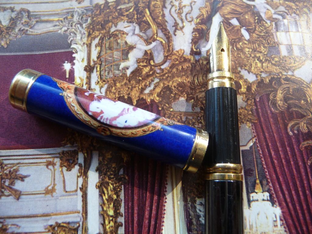
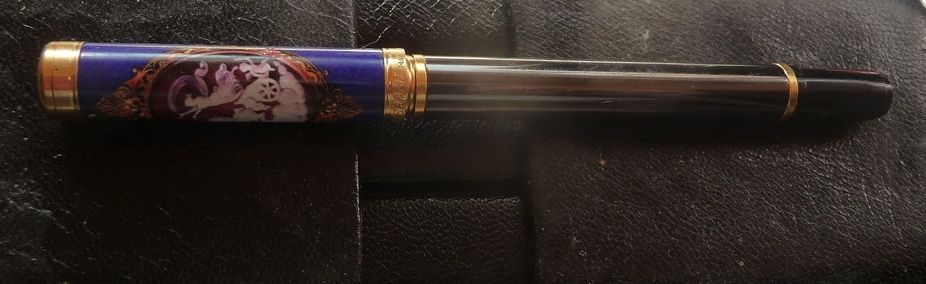
Then there's the Lady Alice, in gold or silver plate; the Lady Charlotte, in lacquer finish (some in a delightful eggshell crazed pattern); the Lady Patricia, a metal pen with a carved chequerboard finish; and the Lady Anastasia, which has a printed little baroque cartouche reminiscent of St Petersburg's golden age on the cap (there's also the 'Reve Latin' version which has a more southern influence).

The Anastasia is very recognisable, so when I saw a royal blue cap in a box of junk at a car boot I was quite excited. The excitement didn't last - the cap was all there was left of the pen, with a section firmly gummed into the cap so I couldn't see whether it had a nib or not. Still, the price demanded (20 euro cents) seemed more than fair, so off I went.
Baroque beauty
Now, one of the great things about modern Watermans is that many of the components are interchangeable. Nibs often fit more than one pen, so I thought I had a reasonable chance of finding a barrel that would fit, either in my parts box or as a temporary fix borrowing from another pen.

I've picked up quite a few modern Watermans at sales, and I had a Laureate rollerball in gunmetal that has a slimmer body than the fountain pens in that range. I tried it. Hurrah! It worked! At least that sorted out the issue of how to get the section out of the cap, and showed that the pen had a gold plated steel nib, in perfect condition, and (if you look closely you can see it) with a heart-shaped breather hole. I rather like that - at the same time complementing the feminine nature of the pen, and providing a reference back to Waterman's early history.

The resulting pen is ugly - the colour clashes and the barrel is way too long for the pen - but I can use it, and the nib is a good little writer, like most Watermans of this era.
Ugly. Ugly. Ugly. But it works.


Flushed with my success, I now have another victim on my operating table: a Lady Patricia, bought without a nib, which is going to get a transplant from an Executive.


Friday, 13 November 2015

An Indian 'Duofold'

The golden age of the Indian fountain pen may just be beginning.

Four or five years ago, when I first got seriously interested in Indian pens, they were very much a minority interest. Chinese pens had a huge following, while Indian pens had very few lovers (or so it seemed). And the Indian pen industry was gradually being whittled away as manufacturers and retailers gave up on fountain pens in the age of the cheap ballpoint.

Now things are changing. A new generation of Indian fountain pen lovers has arrived, and with them new manufacturers - Fosfor and ASA Pens - together with a basic structure of e-commerce to support some of the smaller manufacturers. Ranga Pens is exporting, with Peyton Pens selling their products into the US, and there's a thriving Indian pen forum on Fountain Pen Network, through which I've been able to participate in three Group Buys (thanks to Vaibhav Mehandiratta and jjlax10.

The joy of ebonite! The tiger and the fire
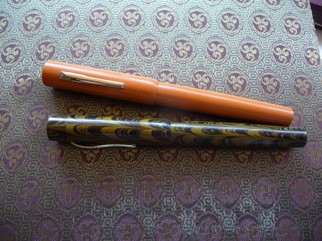
These two beauties arrived through one of the group buys - Ranga Model 3s. One is in brown and black ripple, a fairly conservative, though striking, combo, but the other is outrageous in premium orange ebonite. The colour in real life is a little more muted, towards terracotta rather than fluorescent orange, but it's still a pen that draws attention.

They're big pens - 148mm long, and girthy with it - but relatively light in the hand, as the only metal used on them is the nib and clip. Because there's no metal in the section, they're usable as eyedroppers, though I decided to get the version with converter at a slight premium to the pure ED model.

Despite their size, though, they are elegant pens, with a long, cylindrical cap and then a gentle swell in the barrel till it starts to taper away again towards the end. I particularly like the curved lip at the end of the cap, and the fact that there's no step between the barrel and the section. The clip is quite modern, simple, and elegant, and feels pretty rigid (all my pens are desk pens and never go in a pocket). If I have one quibble, it's that I find the lip at the end of the section just a tad too prominent and occasionally annoying if my fingers slip on to it.

The finish is very good. The pens are buffed to a nice polish, and the details are well turned. Lovers of the snap-on cap, though, should note that it takes a good few turns to twist the cap on and off, and the barrel to section threads are much deeper than on most C/C pens. These are pens for sitting at your desk and writing at some length; they're not for jotting down notes "as and when" .

I chose broad nibs with both pens, and eventually I'll probably have a go at grinding them to cursive italic. To my great delight they both wrote straight away - ten out of ten for "out of the box" performance, on which much more expensive pens often score poorly. The nibs are Jowo. (Better nib choice is one of the things that's changed in the Indian pen industry, which for a long time offered a choice of scratchy steel nibs or scratchy gold-plated steel nibs.)

I've christened the orange one 'Big Red' already. And I do have an original Parker Big Red - but this one's bigger if not redder! These may not be duofolds, but they are real classics - and you can get five or six of them for the price of a modern Parker Duofold.
Two Parkers and a Ranga. The little Parker is a mess, but I love it.

Parker and Ranga nibs and sections. Parker is much more gently flared and a lot shorter