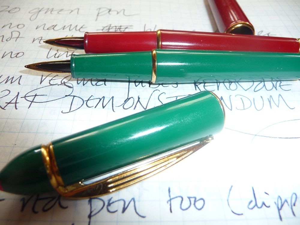
Calligraphy pens are a special subset of fountain pens. Some manufacturers simply create calligraphy versions of their regular pens; for instance there's a Visconti Rembrandt calligraphy set (reviewed on
FPN), there's a Parker Vector calligraphy set, and there's a
Kaweco Sport calligraphy set for calligraphers who need a pocket pen.
Other manufacturers create pens dedicated to calligraphic use, and generally based on the style of the desk pen or dip pen nibholder, with a long tapering barrel. The Rotring Artpen is probably the best known, but I've managed to collect quite a few others over the years. So in this review I have been able to compare:
- Rotring Artpen.1.1mm and 1.5mm.
- Reform Calligraphy 1.5mm.
- Lamy Joy
- Pilot Parallel 2.4mm, 3.8mm, 6.0mm.
- Lamy Joy 1.5mm.
- Reform calligraph 1.1mm (not to be confused with the Reform Calligraphy)
- Online 'nuwood' calligraphy set.
- Pelikan graphos
- Sheaffer No-Nonsense** (see the note at the end of the post)
Just looking at them, there are a few odd pens out. The Reform Calligraph - these two pens came in a set, in a rather nice black stained wood box - is a really stunning little pen, looking a little like a Pelikan in its general shape, with the 'beaky' clip, prominent tassie, and black-and-gold starkness. It's a piston filler, too. The Online pen has the same curves and katana-shape as the Waterman Serenité; it's in a very stripy wood, and the shape of the pen brings out the figure in the wood in a way that very (very) distantly reminds me of an Omas 'arco' celluloid.
The Sheaffer No-Nonsense is a calligraphy version of a standard pen, modelled on the 1920s Sheaffer flat-tops. So this one too stands out from the dip-pen look-alikes.
The Pilot Parallel., closed, looks very similar to the other 'dip pen' styles. Open it, though, and you see a big difference; instead of a conventional nib, with a slit to draw the ink towards the tip, it has two plates of metal, sandwiching the ink between them. This lets it cover much larger sizes than the other nibs and it's my go-to pen for big initials - and also for practising new scripts, since when you're working in that large a size, you can really see the faults in your writing.
The Pelikan Graphos is an amazing thing. It's really a technical pen, not a calligraphy pen, but some of the nibs are useful for calligraphy, particularly the 'N' nibs which aren't that different from the Pilot Parallel's. It's not a fountain pen but a sort of slightly-larger-reservoir dip pen, with nibs that clip on rather than push in.
I've used them all with the same practice piece, in the French style of écriture ronde, working on 'a Christmas Carol' - mainly, since everyone else in my class was working on menus, the descriptions of food. Except for Pelikan Graphos. It just would not do the job.
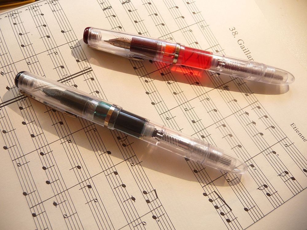
Rotring Artpen
This pen looks very, very simple, but it's quite cunningly made when you look closely. (Compare the Reform Calligraphy, coming up, which really
is a simple pen, in manufacturing terms, and not such an attractive one.) There's a white finial at each end of the pen, the famous red ring (Rot-ring) between barrel and section, and a washer clip that springs nicely out; in the depressed centre of the cap end, white letters on a black insert show the size of nib. That's really handy if like me you want to have two or three different sizes on hand at the same time. With most of the other pens (except the Reforms, which have the nib size written on the barrel, and the Pilot Parallel which has a similar - though not so well made - sticker on the top of the cap) you have open the pens up to look and see what you've got in the way of nibbage.

First off, a fault that makes me absolutely mad every time I fill it up. The ribbed section is great to hold, and the converter is robust with a piston that's always positive and smooth in its action. But the ribs hold ink, and however much I wipe and blot with a piece of cloth or tissue, there's always a bit of ink that manages to hide between the ribs and then get all over my fingers.
Okay, now I have dirty fingers. But the Artpen is great to write with. It's got an incredibly wet flow, almost too much - there's a bit of feathering on the paper I'm using - and the nib is smooth. Enjoyable writing experience. Very good variation between the strokes, too, with the upwards diagonal strokes that join the letters coming out nicely thin.
You get one choice of colour with this pen - black. I've been told they did come in yellow and red; I don't know if there are any other colours (I'm not counting the Millennium limited editions, which I have four of, as they come with F and M nibs, not calligraphy nibs). If anyone knows where I can get the yellow and red ones, please let me know!
Reform Calligraphy
This is the cheapest looking of the pens, with a soft injection-moulded blue plastic cap (and section in the same blue plastic) on a rather spindly black plastic body. The lines from the mould still protrude on the section, though not enough to be felt when you're using the pen.
It's comfortable in the hand, like the ArtPen - the section is about the same diameter, though not as long and without texture - but the nib is the big disappointment here. It's scratchy, it digs in, and it wrote extremely dry, and kept picking up lint from the paper. I found that while I was writing, on the diagonal curves, like the ascender of the 'd', or the descenders of 'g', 'j', and on the swash caps, it kept trying to veer off at a tangent, that is, into a straight line. It didn't feel fluid at all.
There may be a case for my getting the Micromesh out. But the Rotring, for instance, wrote fine just as it was. In fact every one of the four Rotrings I have has written fine just as it was - one was new, three were second hand - so either (1) Reform quality control was all over the place, (2) someone trashed this pen before I picked it up, or (3) it wasn't that good to begin with.
Lamy Joy
This is one of my favourite pens. Like the Rotring, it's not quite as simple as it looks. There's a little red insert at the end of the barrel to complement the bright red 'paperclip', and the end of the cap is also red. There's an ink window, as there is on the Safari, with which the Joy shares a lot of its styling, and the triangular grip of the section will be familiar to any Safari owner.
The biggest joy of the Joy, for me, is the shiny black plastic (against which 'Lamy' on one side, and 'Germany' on the other, are impressed crisply), and the stylish contrast of red and black. The Artpen, with its matt black, just can't compete.
Its biggest failing? The cap feels a trifle insecure - it is meant to snap on and off, but it's lost its snappiness. And the fact that I don't have a converter for it, and it only uses Lamy cartridges. Where are my Lamy cartridges when I want them? Okay. I'll have to swap the converter out of one of my favourite Lamys, the briarwood Accent.
As for writing; this pen has a lovely wet flow, a little bit less so perhaps than the Rotring Artpen, and the nib gives a bit more feedback, too; it's quite noisy. But it's a joy (sorry!) to use. I love the grip, which prevents the pen turning in the hand and spoiling the angle of the writing. Line variation, again, is good, giving me some nice crisp writing.
Pilot Parallel
This pen does well in the looks department, with a vivid coloured cap on a slivery grey barrel. As the 'clip' is there to stop the pen rolling, not to put it in your pocket, it's simply a nub, or rather a fin, of plastic. (Alas, that means when I put the pen in my pen wrap, it doesn't clip on to the flap like my other pens; so it stays in the pen mug all the time.) A little icon on the cap shows that it's a twist cap, it takes quite a few full turns to remove it, but that's okay - you're hardly going to be using this pen for notetaking.
The nib consists of two plates of metal between which the ink flows. That delivers a very wet and even flow of ink even at the remarkable width of 6mm. It's also a very tolerant nib - I don't find it scratchy, it doesn't dig in, and it seems to float nicely on a cushion of ink like a little calligraphic hovercraft.
However there is one issue with the pen and it's that of the converter;
opinions vary on whether you can use the converter which comes with the pen for ink, since it's only intended for flushing the pen. I've not had any mishaps so far... And a second issue is that the larger sizes of nib seem to get very dirty very quickly, leaking quite a bit of ink into their caps.
Reform calligraph
Looks like a Pelikan. Eats like a Pelikan (with a piston). Light in the hand, glossy black plastic and 'gold' accents. This is a calligraphy pen? Apparently so.
I really enjoy using this pen. First of all, as we know from the poem -
A wonderful bird is the Pelican,
His beak can hold more than his belly can -
Pelikans can hold a whole lot of ink. So can this Reform. Being a piston-filler it uses bottled ink, happily swallowing it down, no proprietary cartridge. It fills nicely, wipes down nice and clean, is ready to use good and fast. Secondly, it's light, it's not weighty, it doesn't draw attention to itself. I find for a good small italic hand, this pen really works delightfully well. And it works beautifully in Ronde, too. A little more edge than some, but not scratchy. It's one heck of a big jump up in quality from the Reform 'calligraphy' pen, not just in looks but in writing experience.
It did however perform slightly patchily with regard to ink flow, possibly because I'd just refilled it after leaving it some time unused. Once it got going, having started rather hard, it did quite well. I found the 1.1mm a bit small for the script after using so many 1.5mm nibs, though.
If you find the Lamy Joy and Rotring Artpen a bit large for your hand, you might want to look around for this vintage experience. I found mine in a car boot sale, but I do see them from time to time on eBay.
Online 'Nuwood'
This pen looks lovely. But it feels a bit cheap in use; the clip isn't very sturdy, the section unscrews from the barrel far too easily, sometimes when I'm uncapping it, and the converter has a rather fragile feeling transparent plastic piston.While the metal section is matt, not shiny, so my fingers don't slip, the section is very thin, and there's quite a sharp edge between the barrel and the section, which isn't comfortable to write with.
The nib is good; wet, and crisp, delivering good strong lettering. But the pen as a whole feels as if it has pretensions to quality that it doesn't quite attain. I found my hand cramping up a bit after a while. And the pen is quite heavy, which together with the thin section, resulted in my maintaining a death grip on the pen and eventually getting cramp in my fingers.
One great thing about this pen, though. It doesn't roll about on the desk; even uncapped, the roughly triangular section and the curve of the body prevent it moving.
Pelikan Graphos
This pen has stunning simple looks - cylindrical, shiny black ebonite (in the oldest ones, I think, and celluloid later), with a simple steel formed wire clip that seems to prefigure the Lamy Safari/Lamy Joy clip. I particularly admire one lovely piece of functionality; the cap screws firmly on to the back of the barrel, rather than 'posting' conventionally. Considering it's a technical drawing instrument, aesthetically it scores ten out of ten on the Bauhaus scale.And apparently, the body of the pen works as an ink reservoir, but because of theway the nibs clip on to the feed, you can swap nibs without having to empty the ink out - now that's great thinking.
The nibs on the other hand are incredibly ugly. They're the kind of thing doctors and dentists whip out in my worst nightmares.
And it's difficult to fill, unless you have an original Pelikan bottle with a teensy tiny spout, a bit like the tube that comes with 3-in-1 oil aerosol cans, to poke into the hole in the feed. I suppose at a pinch you could use a syringe. I had to use it as a dip pen.
So: how does it work?
Um. It's pretty crap, actually. I really wanted to like it, but the nibs are incredibly finicky. They are very crisp, and with practice, would be good for blackletter or a very, very sharp italic. But the thick one kept springing off - you can't apply any pressure at all, and the moment you inadvertently do, ping! off the nib flies across the desk, leaving a spoor of spilt ink - and the thin nib kept biting into the paper. This Pelikan is
not house trained.
I might try the 'freehand drawing' nibs (S nibs). But then, they don't have the line variation. So regretfully, this one is consigned back to its box.
Sheaffer No-Nonsense
This pen is quite chunky in the hand, and has a rubbery, textured section that makes it very easy to keep a grip on. It's transparent, in various colours - I have red, green, blue -
and comes with various widths of nib. I have a small collection of No-Nonsense pens, ranging from cheap advertising pens I've picked up at sales to a rather lovely chased black one with vintage style trim, modelled after the black hard rubber pens of the 1920s. My favourite is a marbled mauve-and-pink one which looks almost like one of the more colourful celluloids of the 1920s and 1930s - it wouldn't be a Sheaffer but perhaps a Burnham or a Swan. These pens are all cartridge/converter pens.
The nib is much wider than the Artpen and Lamy nibs, both in the centre, and at the business end, though it doesn't seem to
write any wider than the others. The section, I think, while it's functionally fine, is rather lacking in the design department - it's a sort of truncated cylinder, with no taper at all. And the NoNonsense has proprietary cartridges, though I found generic Parker or Waterman style cartridges would work in it. No converter came with the pen.
I find the Sheaffer very easy to write with. A good line, not quite as wet as the Pilot Parallel or the Online, but very crisp and regular. The nibs don't seem to catch the paper with their corners. But the slight dryness does seem to make the pen harder to push across the paper. On the other hand the section is one of the most comfortable for me, together with the Lamy.
Favourites?
For looks, Lamy Joy, Pilot Parallel, and the Reform Calligraph are very nearly level pegging - I think the Joy, for the quality of its finish and the precision of its design, just edges the others out. (The Graphos also looks delightful, with its severe cylindrical form and glittering black, but unless I can get a nib that works in it, I'm going to disqualify it from the competition here.) The loser, in the design stakes, is the Reform Calligraphy. Horribly cheap looking and undistinguished.
It's the loser in the writing stakes, too. The outright winners there are the Pilot Parallel, the Rotring, and the Lamy Joy, with the Reform Calligraphy coming very close. Sheaffer No-Nonsense and Online I can use happily, but they each have issues - the small section and abrupt transition of the Online pen, and the slight dryness of the Sheaffer.
It's worth pointing out that there are three pens in here that might make it into an EDC. The 'dip pen' styling makes pens almost ineligible for every day carry status, since they are too long for most pen cases. But the Reform Calligraph, Sheaffer No-Nonsense, and Online Nuwood, will all fit a regular size pen case or wrap. Out of those, I'd pick the Sheaffer. (Why not the Reform? I just don't want it to take the hard knocks. The Sheaffer is cheap enough to risk it.)
It's been fun doing these reviews. I just hope my calligraphy teacher doesn't find out. He keeps telling me I have to use a dip pen...
** I've just had it pointed out to me that the Sheaffer in question is actually a Viewpoint, not a No-Nonsense. It does belong broadly to the same family of pens, but the No-Nonsense is earlier, and writes better - I'm not the only one to prefer the original No-Nonsense,
apparently.
 It's not quite a Parker 51 but it's obviously got a family resemblance, with a gold filled cap and streamlined body. Open it up and it has the same hooded nib. An incredibly good-looking little pen.
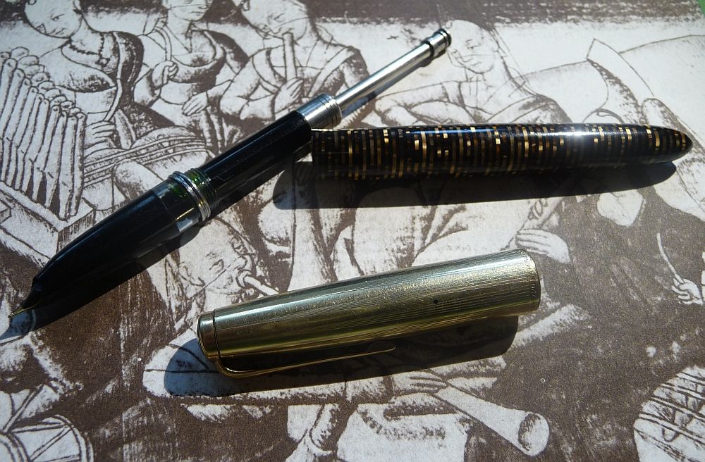 The one thing that is intensely annoying about the pen, though - and you can see this in the photo if you look closely - is the metal clutch ring (very similar to the Parker 51, as are the 'fingers' inside the cap). It's not attached to the pen, so every time I unscrew the section to refill with ink, it falls off. It's a pity such a nice pen is let down by such a small fault.